Oummi
Stick and Find
How many times in the past week have you asked yourself or someone around you,
"Where is my _______?"
How many times have you lost or misplaced an item recently?
OVERVIEW
Problem Statement
How many times over the course of your life, you were about to leave the house and were running late, and you realized one of your important items is missing and you don't know where to find it? Whether it's your wallet, keys, phone, you name it. People lose or misplace their items all the time, and the average person spends a good a mount of time over the course of their life searching for those items, and wastes a large amount of money replacing those items. This is an evident problem in people's everyday life, and although there are some highly-reviewed products on the market to aid with this issue, there is yet to be a cohesive solution for this problem.
The Goal
Design a smart home device that helps users locate a variety of their lost/misplaced items easily.
Role
UI/UX Designer, User Researcher
Team
Solo
Tools
Adobe XD, Adobe Illustrator, Fusion360, Keyshot, Adobe Premier Pro, Arduino, 3D Printing
Skills
Need Finding, UI/UX Design, Research, Physical and Digital Prototyping, User Testing, Coding
Duration
6 weeks
RESEARCH
Articles & Papers
To begin my research for this project, I went online to look for resources related to the problem I'm trying to solve to get a better understanding of the scope of this issue, and to see if there is a reasonable need for the product I want to create.
Most of the articles gave an estimate of how much time and money a person wastes searching for their lost items, as well as a list of what items people tend to lose the most.
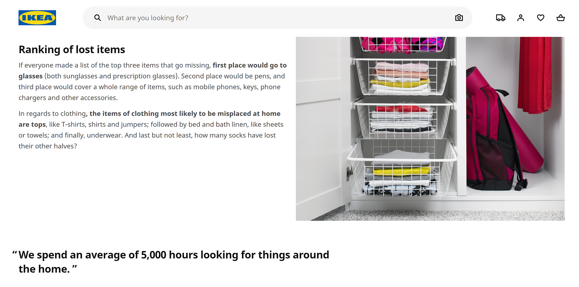

"Average Americans spends one year of their life looking
for lost or misplaced items"
~ US News and World Report
"On average, we spend 6 minutes looking for our keys in the morning"
~ IKEA
"The average American wastes 55 minutes a day
(roughly 12 days a year) looking for things they own but can’t find"
~ Newsweek
"The average office employee spends 1.5 hours a day
(6 weeks per year) looking for things"
~ OrganizedWorld.com
"Americans waste more than 9 million hours [combined]
each day looking for lost and misplaced articles"
~ American Demographic Society
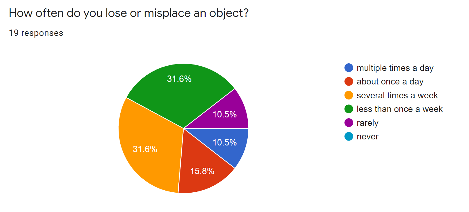
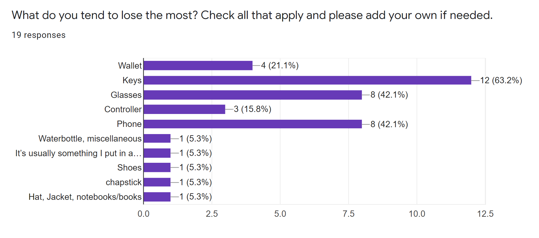
Survey
I decided to conduct my own survey to see how often people lose or misplace their items, and what kind of items they tend to lose the most. I also tried to find a target demographic through this survey, but failed to do so since I only got 19 responses.
Market Research
I then did some market research to see what products are currently on the market that attempt to solve this problem, and understand the strengths and weaknesses of those competitor products.
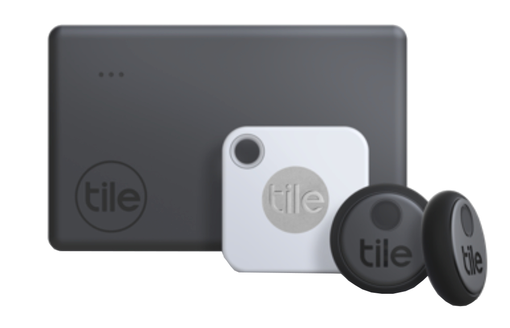
Tile Tracker
Tile was originally a small squared keychain that gets attached to the object you frequently lose, and it connects to an app on your phone for you to track it. There is a sticker version that can be attached to multitude of objects, and there is a card version to put in your wallet.
Pros:
- Works on many objects since it comes in 3 main types.
- "Rings" to help you find the item, and has GPS tracker.
Cons:
- Uses an app to track all the items, so what happens if you lose your phone?
- Looks bulky and does not look aesthetic (during the time this research was conducted, there were no design variations or customization to the Tile products)
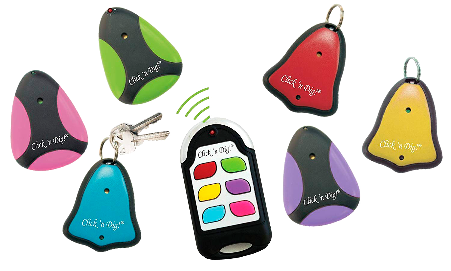
Click-N-Dig
This product comes in the form of a keychain and a controller to help locate the items the keychains are attached to. Each controller can have up to six items connected to it.
Pros:
- Works well for keys
Cons:
- Uses a small controller to track the items. What happens if you lose the controller too?
- Not very aesthetically pleasing
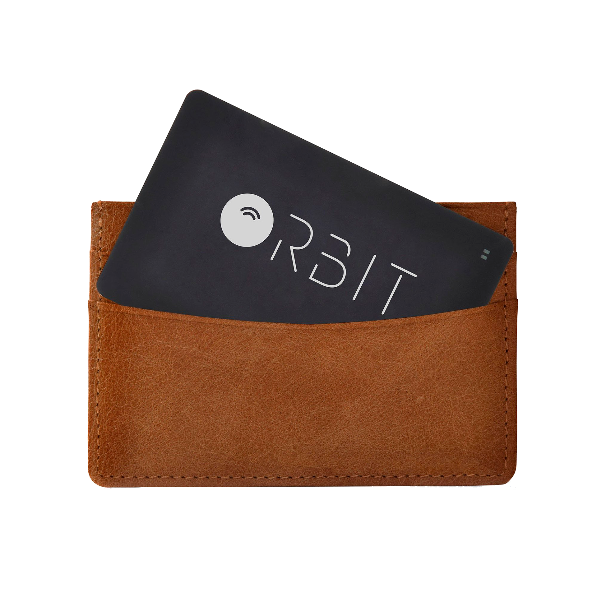
Orbit (Wallet Finder)
Orbit has a few products to help locate lost items. This one is made specifically for wallets. The card is placed inside the wallet, and can be tracked using an app that allows the user to check the last known GPS location of the card and make it ring if it is within range.
Pros:
- Works well for wallets.
Cons:
- Uses an app to track the wallet, so what happens if you lose your phone?
- Does not work for a variety of items.
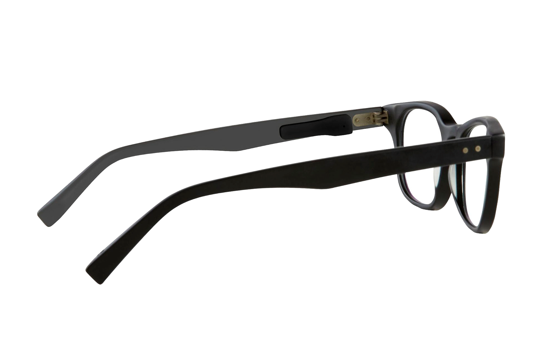
Orbit (Glasses Finder)
This Orbit product is made specifically to help locate lost glasses. It uses a very small sticker that can be discretely attached to the inside of the glasses. The glasses can be tracked using an app that allows the user to check the last known GPS location of the card and make it ring if it is within range.
Pros:
- Works well for glasses and maybe some other items
Cons:
- Uses an app to track the wallet, so what happens if you lose your phone?
- Not aesthetically pleasing to be used on items other than the glasses.
User Interviews
After doing the survey and market research, I reached out to some peers and family members to get their insight on this issue. I asked them how often they lose items, what they misplace the most, and also took their feedback on the current products on the market to know if they tried any of them, and if not, then why. I also asked that if a device were to exist to help them track lost objects, what features would they want it to have. Here is the feedback from 6 potential users:
👩 Interview 1
● Age: 45
● Gender: Female
● Loses objects about once a week ● Reason: She forgets where she put them. Someone takes her item and does not return it to its place.
● Items lost the most: Phone, keys, glasses. ● Never used trackers on the market since they are not available in her country.
● Ideal device:
○ Stationary device put in the living room or bedroom like an old home telephone.
○ Have specific button for each item.
○ A way for the device to give directions, like compass or arrow instead of sound alone.
○ Maybe a wearable? Like an apple watch.
○ Ornamental or blends easily with the room décor.
○ NOT an App since she loses phone a lot.
○ If a stickers, preferably customizable in different shapes and colors.
👩🦰 Interview 2
● Age: 56
● Gender: Female
● Loses stuff very often, at least once a day. ● Reason: Forgets where she puts them. Does not have a set place for some of the stuff.
● Items lost the most: Phone, glasses, purse, wallet, headphones, charger, shoes, jacket, cards. ● Never used trackers on the market since they are expensive and bulky. Tried using the "Find My iPhone" online tool once but it did not work for some reason.
● Ideal device:
○ Can hang on wall or on fridge. If on table, organic look, maybe wooden.
○ Preferred location is kitchen or living room.
○ Sticker for regular objects, a pin for clothing.
○ Customizable design and color, doesn’t like having logo on it like Tile.
○ No App, because if phone is lost, everything is lost.
○ Would be nice if there is a detachable portion with a compass.
○ Detachable piece can ring until placed back on main device.
○ Have different users in the interface if it’s used by family.
👨 Interview 3
● Age: 49
● Gender: Male
● Loses objects more than once a day. ● Reason: Very forgetful and cannot remember where he puts his items.
● Items lost the most: Wallet, phone, watch, glasses, keys ● Have heard of Tile and seen it in stores, but it's expensive and uses an app, which he doesn't like.
● Ideal Device:
○ Simple and easy interface.
○ No App preferably. If an App, then also have a website so if phone is lost, all info is still accessible.
○ Has other functions, like clock, shows room temperature, and has flashlight to help you look for things.
○ If stationary, then preferred placement in the living room next to TV and other home devices.
○ Maybe can show what room/floor the object is in.
○ Has a compass with arrow that pulses the closer you get to item, like the old game.
○ If you lose the device, maybe you can call its name and it’ll respond like "Hey Siri".
○ Would love to have icons to represent different items, like keys.
🧔 Interview 4
● Age: 47
● Gender: Male
● Loses items about once a day, but it’s sometimes his kids’ items, not just his own. ● Reason: He forgets where he puts his stuff. His kids take his stuff and don't return them to him.
● Items lost the most: Car keys, house keys, cards, work tools, phone and tablet, kids’ shoes and
tablets, portable chargers. ● Has used one of the keychain with controller trackers, but lost the mini controller between his couch cushions and took him weeks to find it.
● Idea Device:
○ Something that can be placed on any item of any size. Can be placed on clothing.
○ Waterproof.
○ Has option to either make sound or give directions or light in case someone was sleeping in the house.
○ Customizable design, but not too obvious on items. Blends in with item. A sticker.
○ Interface that allows you to organize things by picture. Either real pictures or icons.
○ Has picture of each item in addition to name, and can search by picture in case you forget what you called it in a device.
○ Connects to a website in case device itself is lost. If an App, connects to Alexa.
👵 Interview 5
● Age: 75
● Gender: Female
● Loses items about once a day, but finds them typically within 15 minutes. Some items have been lost without being found.
● Items lost the most: House keys and mail keys (have not been found yet), wallet, ID, glasses, phone, clothing items, utensils. Also loses items when someone borrows them and doesn’t return them to their place. ● Has never heard of the other trackers on the market, but does not like the idea of everything connected to an app. She tried to used the "Find my iPhone" feature once, but couldn't do it since she could not remember her iCloud password to log in online.
● Ideal Device:
○ If someone takes your item, it should prompt them to return it to its place.
○ Issue is usually forgetting where something is if it is not in designated spot, so a way to get user to return item to specific location.
○ Easy and clear interface, not too many steps. Can talk to device like Siri or Alexa.
○ Usually loses items that were supposedly stored in a “safe place” but then forgets where that place was.
○ Would like it to be a flexible sticker or pin, preferably customizable shape and color.
👩🦱 Interview 6
● Age: 22
● Gender: Female
● Loses items about once a day, but finds them within a few minutes of search unless it’s an item that
hasn’t been used in a while.
● Items lost the most: Phone, headphones, lip balm, medicines, wallet, shoes, notebooks. ● Has heard of Tile and gotten ads for it, but does not like the way the product looks to use it.
● Ideal Device:
○ A way to register items in a device, and a clear way to distinguish between items registered so it doesn’t get mixed up with other people’s items if it's a family device. ○ Have the device print out the sticker to attach to item after registering it.
○ Or maybe scanned sticker instead of printed out so you can choose what sticker is for what item.
○ Definitely no logo in big and bold on sticker, and make it a customizable shape.
○ Nothing too bulky, maybe can be a pin or magnetic, can come in different variations and shapes.
○ Gives GPS direction and makes sound, maybe arrow that directs you to location like the Pixie App (another object finding app similar to Tile)
○ Fits in well with the environment, simple design like Alexa. Organic futuristic shape.
Research Insights
1. There doesn't seem to be a target age group, people of all ages lose/misplace their items and can struggle to find them.
2. People like things to be customizable and care a lot about aesthetics when it comes to products they use.
3. Potential users prefer a stationary device over an app since losing phone is an issue for many.
4. A sticker tracker is a favored idea among those interviewed, along with pins and magnets for versatility.
5. Potential users prefer auditory feedback as well as some form of visual feedback to help locate items.
6. The ability to organize and sort information is important for users, as long as the method isn't complicated.
_______________________________________________________________________
Based on my research and user interviews, I decided that my
object-finder product design would have 3 main components:
Physical Device, Sticker, and a User Interface
For the purposes of this project, the main focus will be on the User Interface
_______________________________________________________________________
FIRST PROTOTYPE
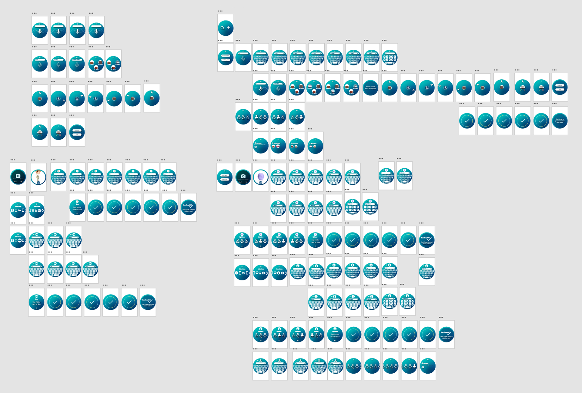
User Flow
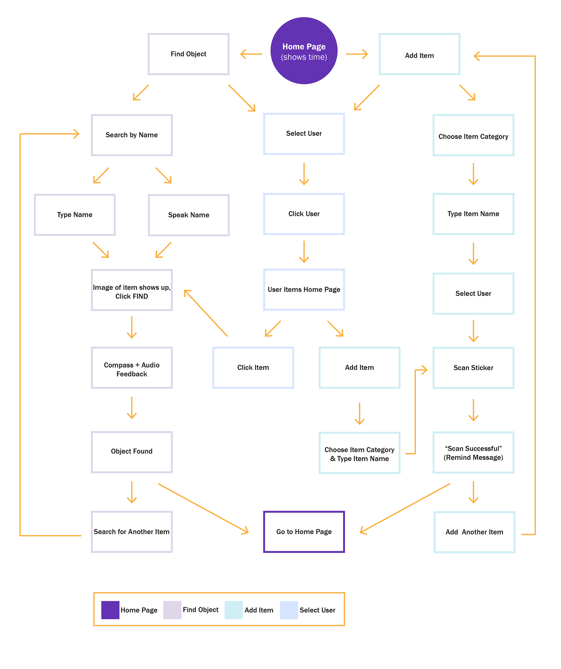
Digital Prototype
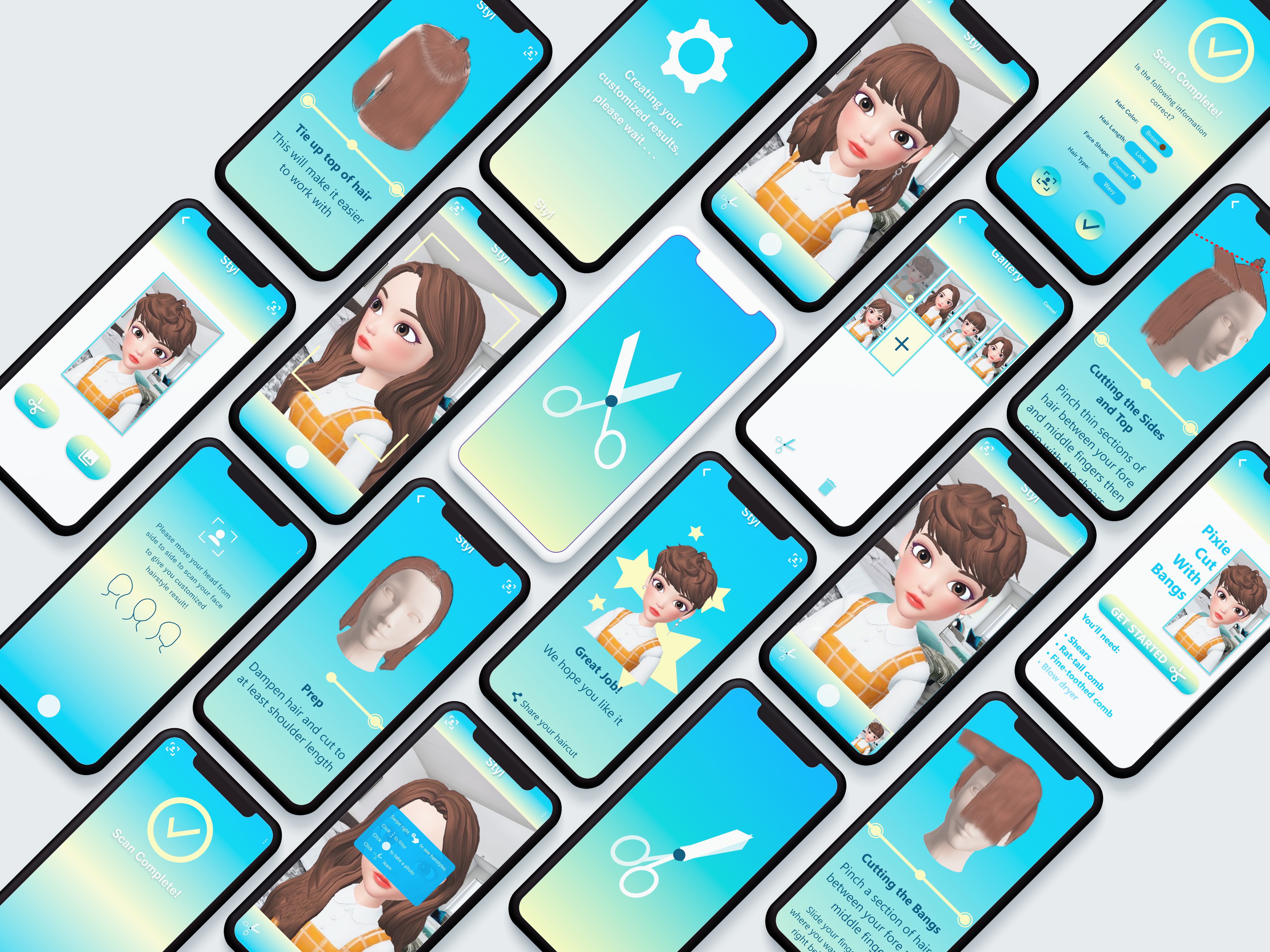
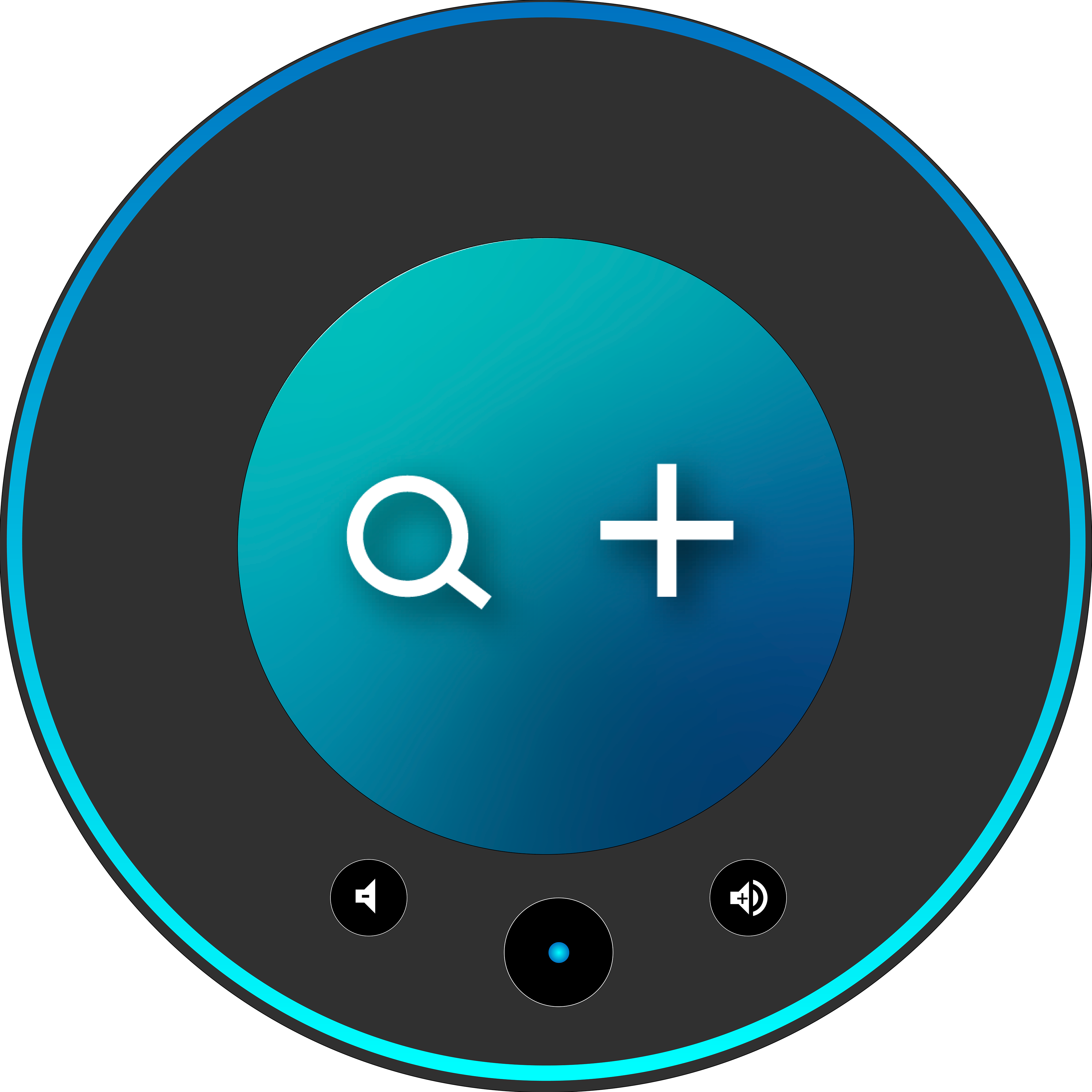
For the digital prototype, I used Adobe XD to create a working mock up. I made the user interface round in shape since according to my trend research and interviews, people aesthetically prefer round shapes over those with sharp edges, as seen through the market success of Alexa and the Google Nest.
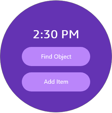
Landing Page
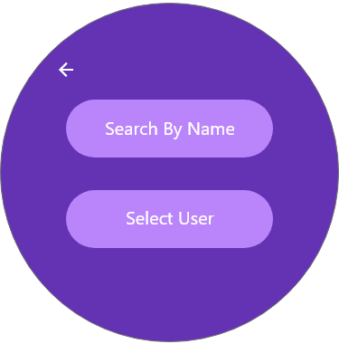
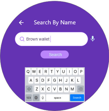
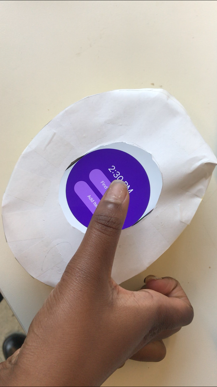
The landing page gives the user two options. To find an object or to add an item to the device. When the user wants to find an object, they can search the name of the object, or go to the User Page to select an item from there.
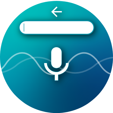
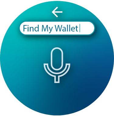
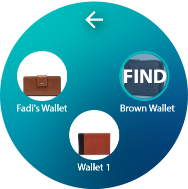
Find Object
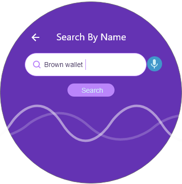
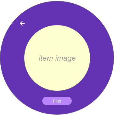
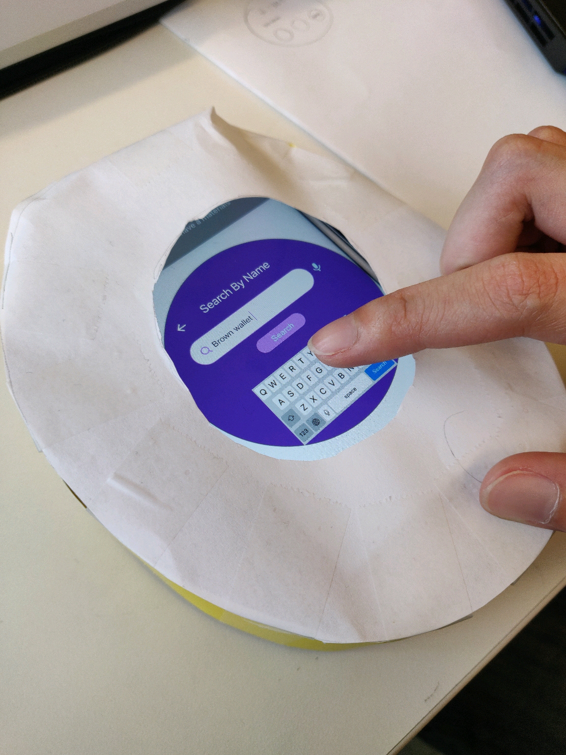
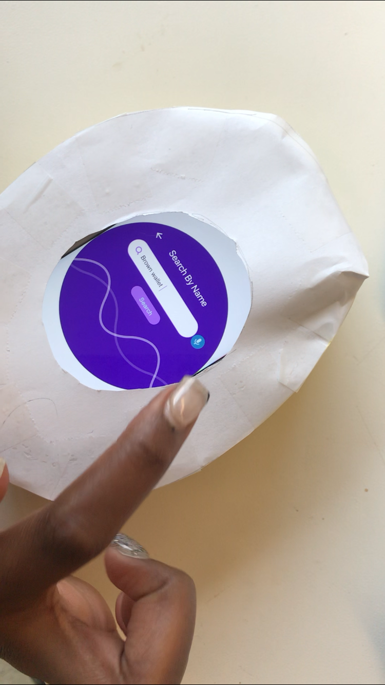
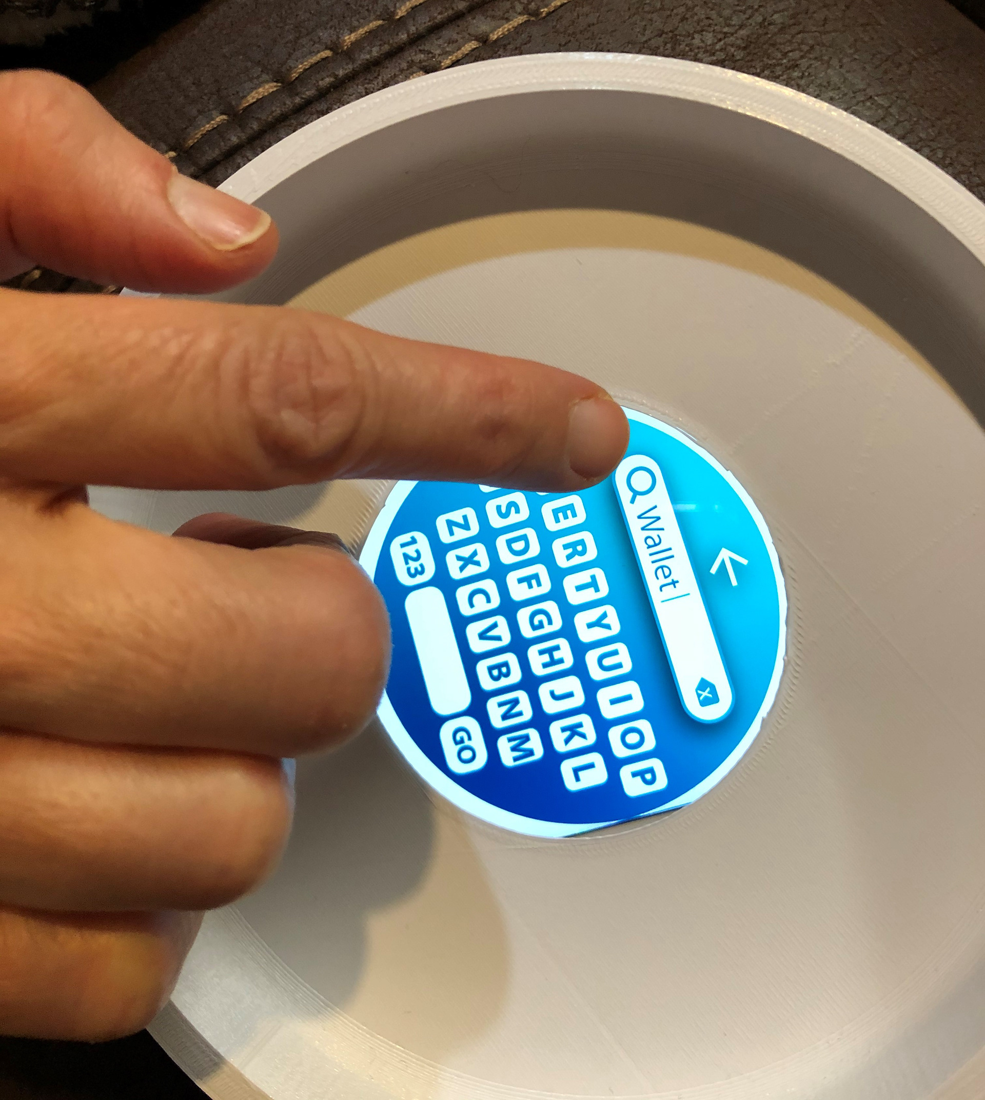
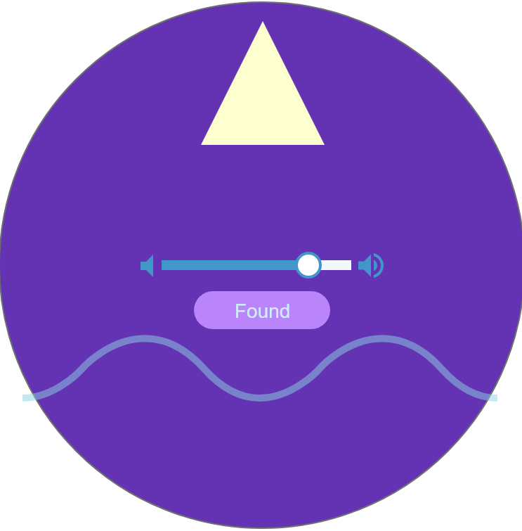
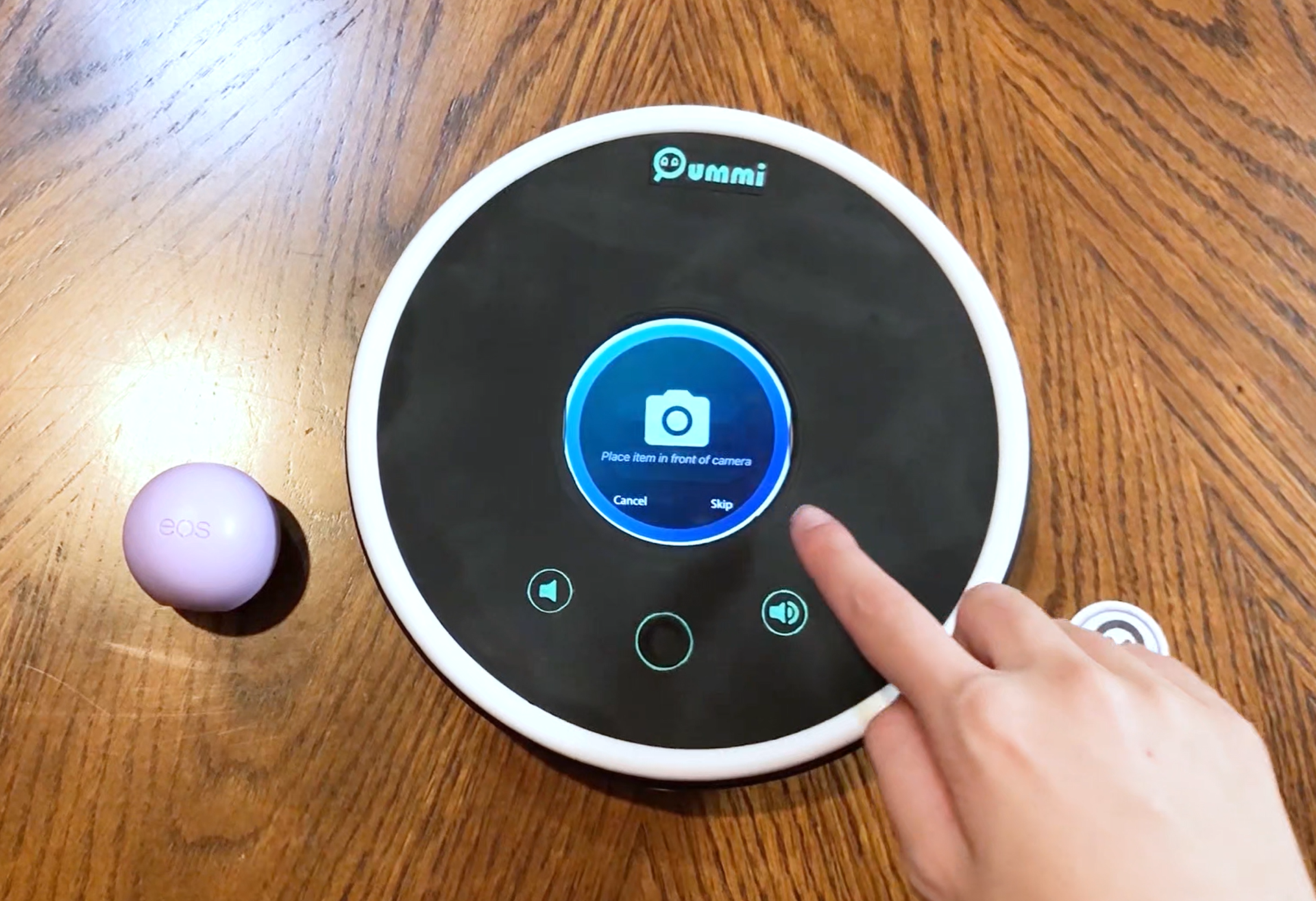
To find a lost object, the user can type or speak the name of the object registered in the device. Then an image of that item would pop up for the user to confirm that it is indeed what they're searching for, and then begin the navigation.
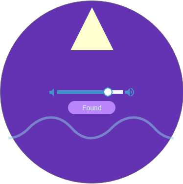
For the navigation part, the user would see an arrow like a compass that points them in the direction of their lost object. The visual navigation is accompanied by audio feedback coming through the sticker attached to the item, and it beeps faster the closer you get to the object.
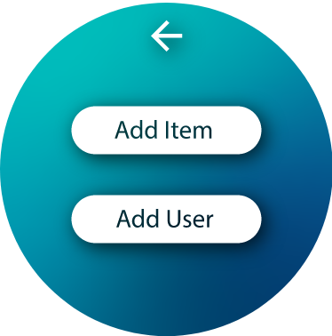
User Page
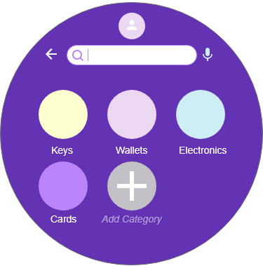
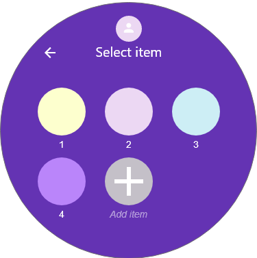
On the User Page, the items each user has registered are organized in categories. The user can add more categories, add items there, and search for an item from there as well.
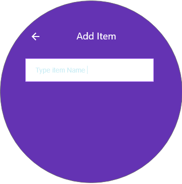
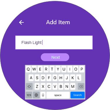
Add Item
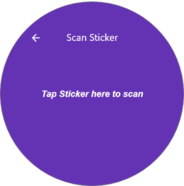
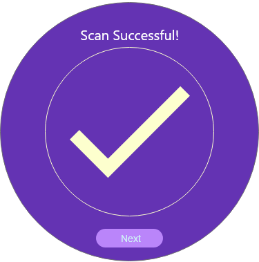
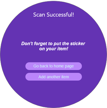
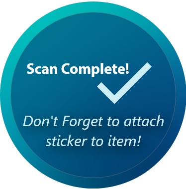
To add an item, the user would create a name for their object and add it to a user and category. To connect the item to the system, the user would tap the smart sticker on the screen of the device then attach it to their item, so whenever it gets lost, it can be easily found.
User Testing & Feedback
User testing was conducted with the interactive UI created in Adobe XD, along with a simple physical paper prototype. The phone that contained the UI was placed inside this paper mock up, so with that, users could imagine what the actual device would look and feel and provide feedback on it as well.
Feedback Pt. 1
● Keyboard for typing is too small.
● How will the physical device be used? Is detachable and carried around the house?
● Some interactions are not intuitive.
● The arrow for navigation is unclear. What if item is on a different floor?
● Home page should focus on the two buttons, no need to include a clock.
● Having too many buttons on screen and having categories make it more overwhelming than helpful.
● What happens if you lose items outside the home? And what if you lose the device?
● Having separate users makes the device usable by multiple people, so have a simpler way of organizing information.
Feedback Pt. 2
● Like the round shape, but a circle would look better than an oval.
● For the keyboard, maybe it could be on the physical device instead of the scree. Or at least make it the size of a phone keyboard.
● Some of the icons are too small.
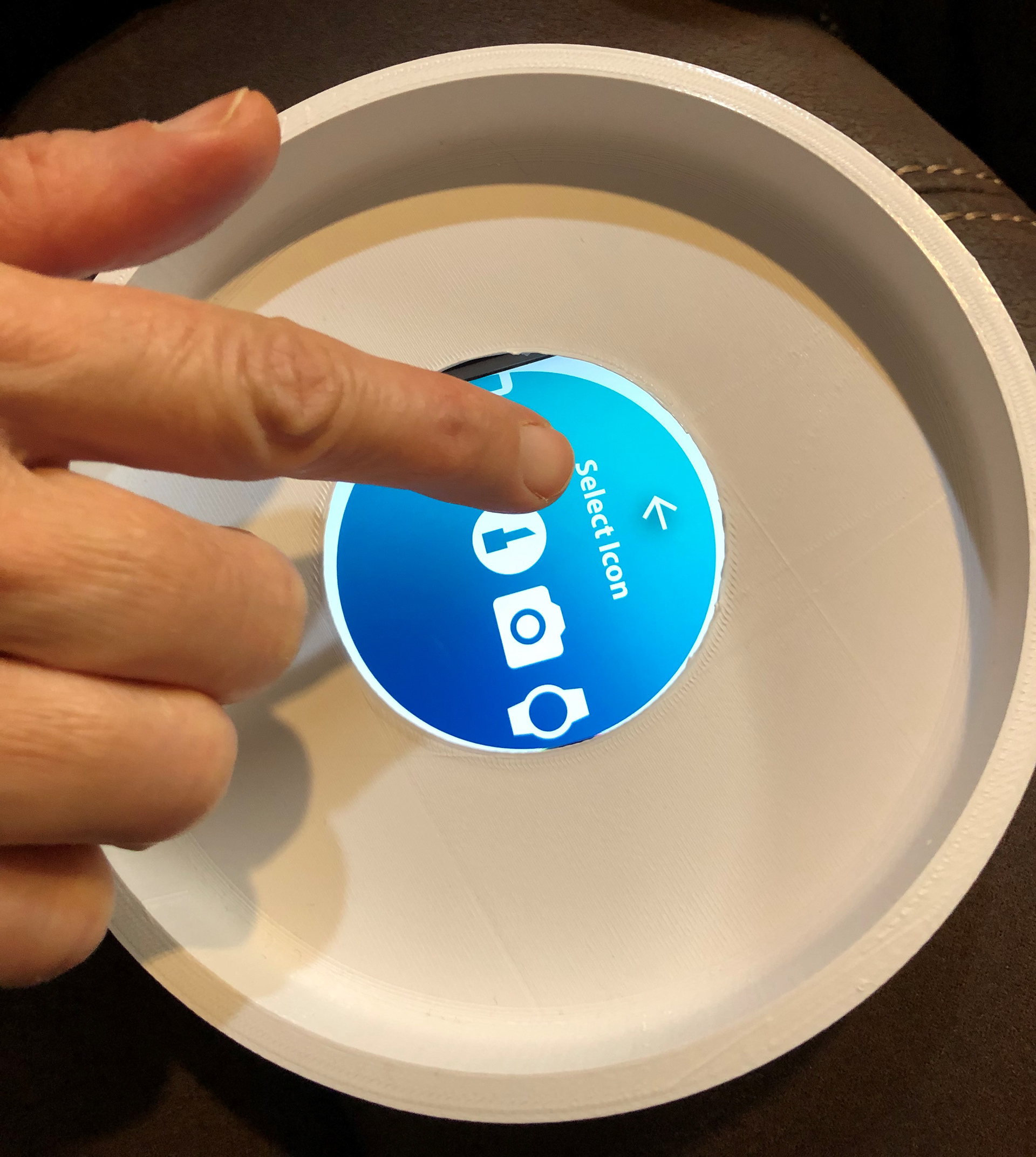
● How will you upload a picture of the item when scanning? Is there a camera or do you upload file from cloud?
● User should have the option to either use a real picture, or customize an icon when inputting an item.
● The information in the device should be connected to a website if device gets lost or you lose an object outdoors.
● The UI is too wordy, focus on using icons to communicate.
● Consider using lights as another form of visual feedback
● Some buttons aren't needed, user doesn't need to do so many steps on their own, let the device do the work.
Insights for Next Iteration
1. Everyone struggled with the keyboard size, so find a better way of displaying the keyboard.
2. Current process to find or add an object is too long, so minimize the amount of buttons and steps for the user to find object. Should be simple, clear, and quick.
3. Some steps weren't intuitive or were too repetitive (requiring double clicks), so make the interaction flow easier.
4. There is the issue of losing the device itself, so find a solution to prevent that from happening, and do more form exploration for the physical and digital components.
For the purposes of this project, the primary use-case will be finding items lost inside the home only
FORM EXPLORATION
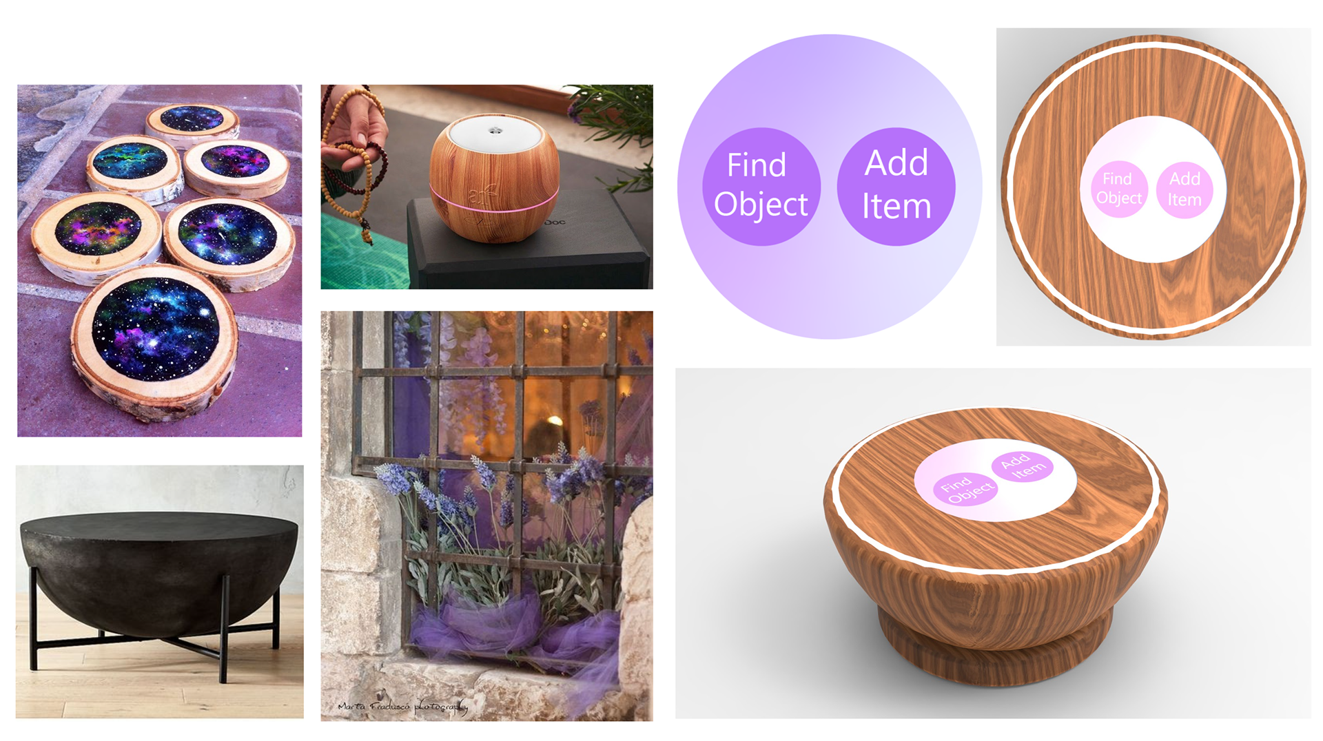
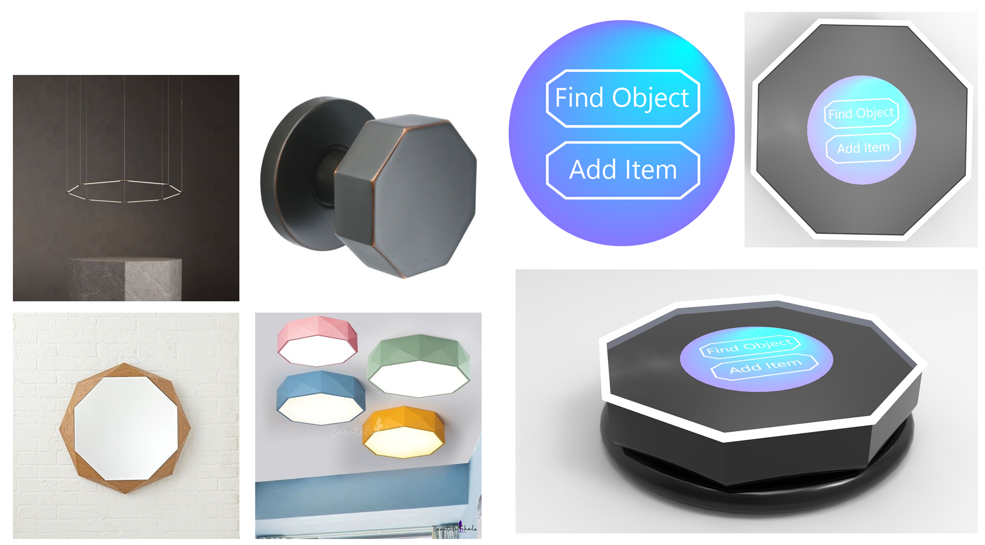
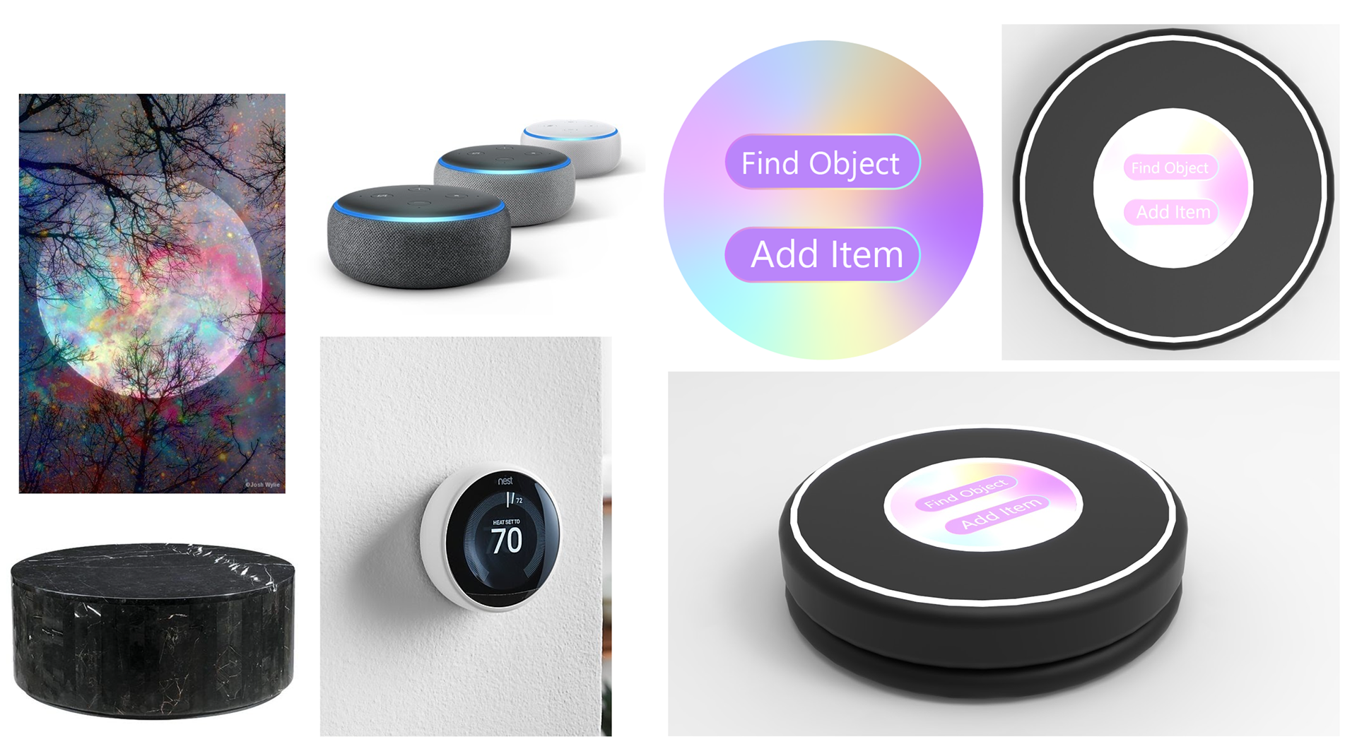
To aid the process of form exploration, I first created three mood boards to help me come up with three possible designs for the form of the device and the color of the UI. From these mood boards, I collected feedback on which ones users preferred, and iterated more UI options to later use for my final concept design.
Mood Boards
Organic, Curvy, Ergonomic
Geometric, Reflective, Sophisticated
Round, Smooth, Colorful
Physical Design Feedback
The majority of the potential users choose this third physical design as their favorite since it seemed thin and easy to carry as compared to the other two designs, which were perceived either bulky or uncomfortable.
As can be seen in this design, there is a light rim that goes around the form to aid with visual feedback, and there's a base piece created to help with the issue of losing the device itself. More on these features will be explained later.
UI Design Iterations
The previous three UI Home Page designs did not win the heart of my audience, so I created some more options with different layout and color gradients to see which style my audience would prefer more.
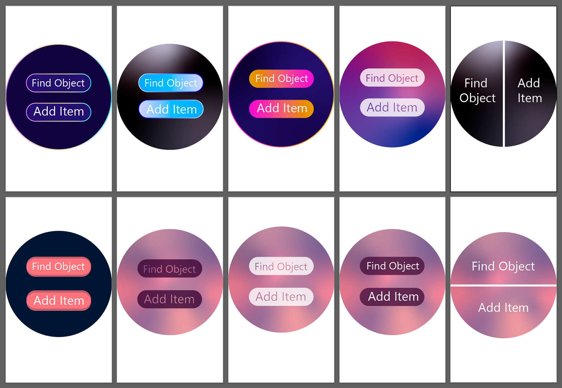
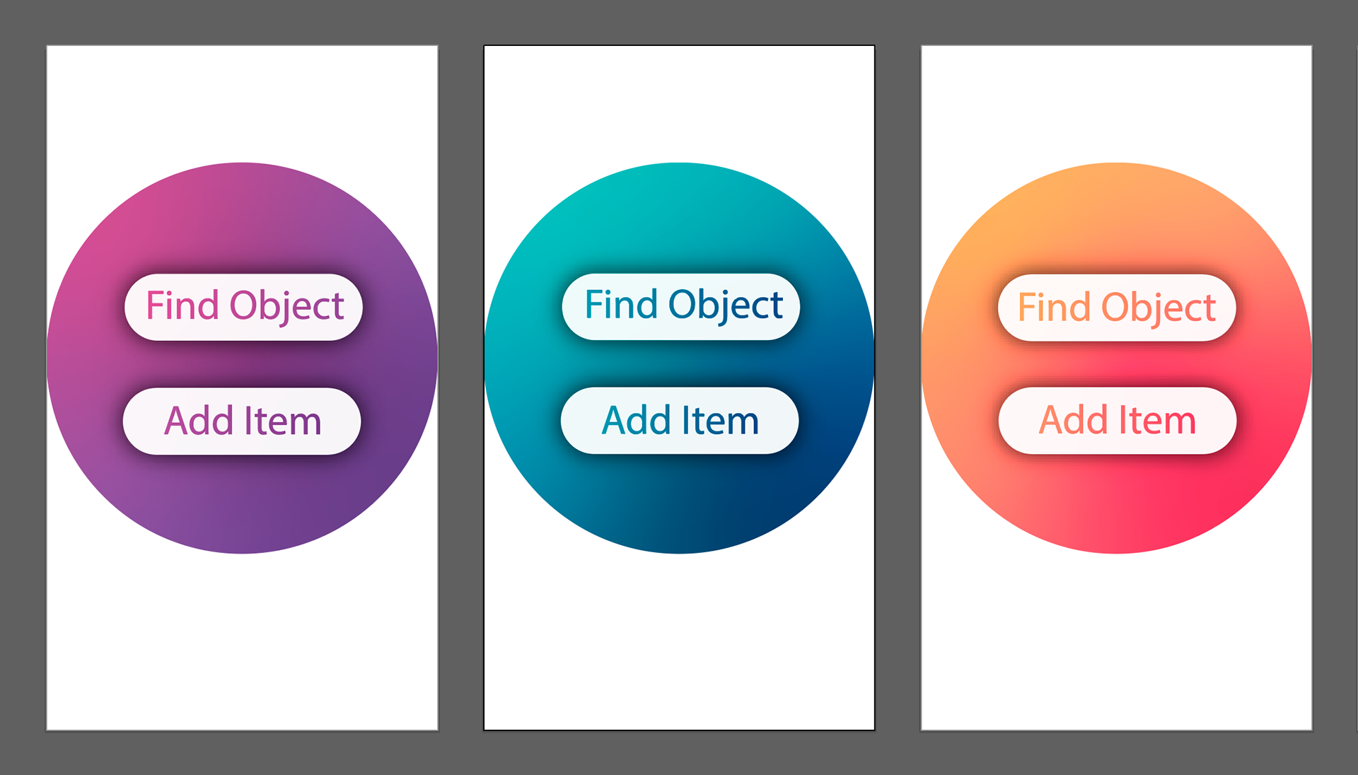
After a few more iterations, I presented my audience with these three color gradient options to choose from, and the teal gradient was the favored option among most.
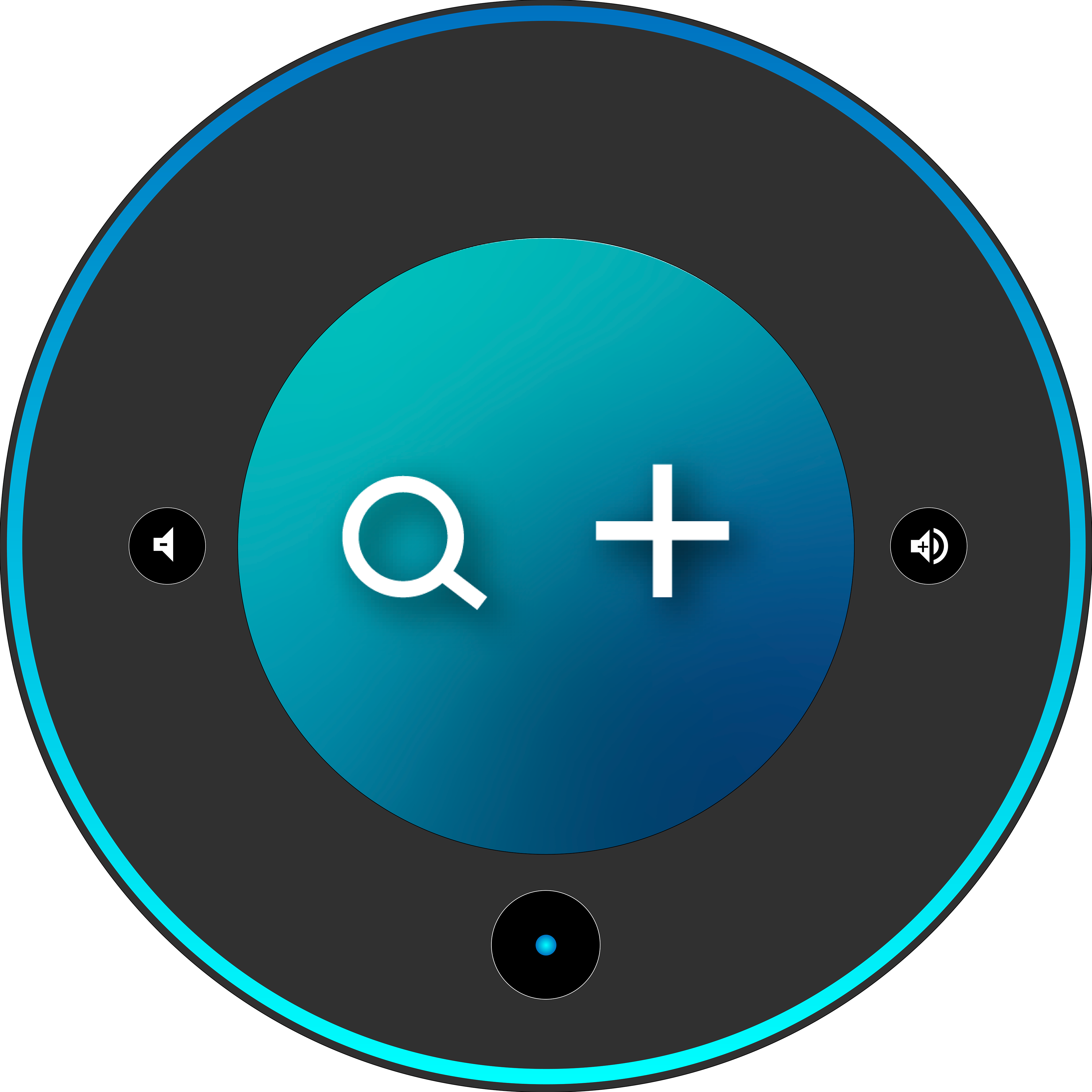
Using the teal color gradient, I iterated some more options for the home screen, and tried using icons instead of text for a few.
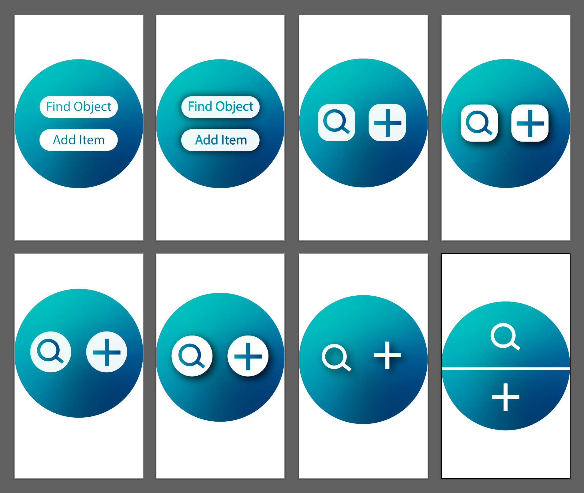

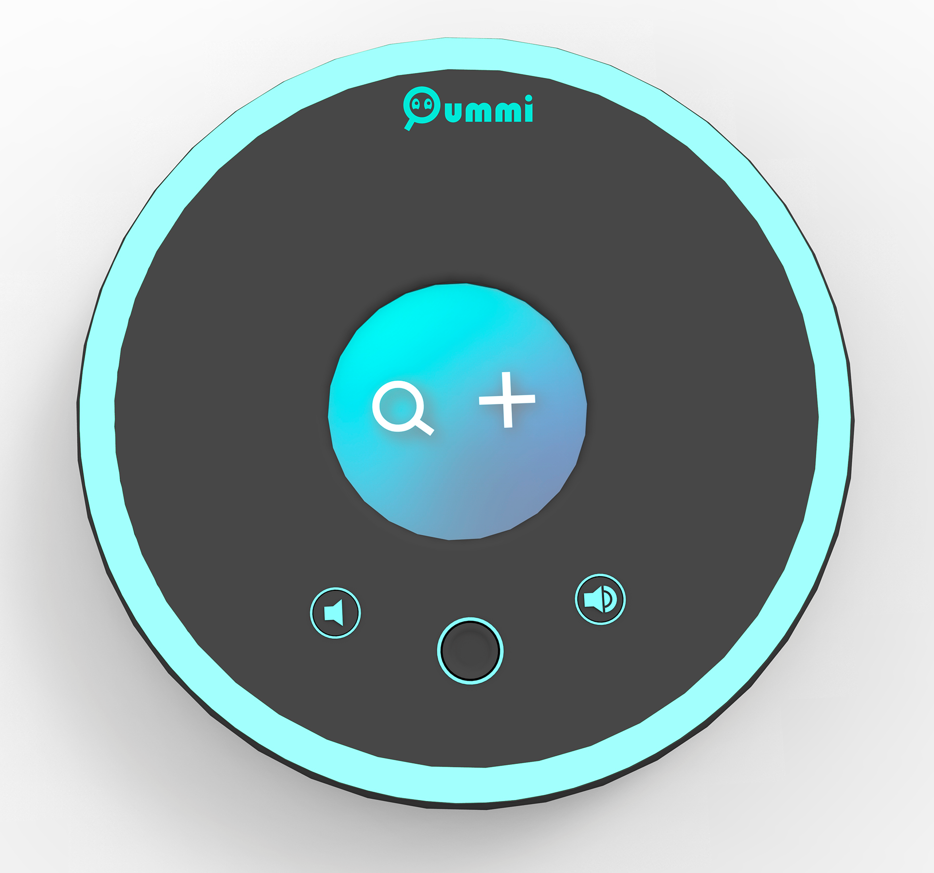
After that last round of iterations, this design was the one chosen for the Home Page of the user interface of my device.
The left icon is for finding a lost object, while the right icon is for adding an item to the device system.
This color and style sets the foundation for how the rest of the device interface and the product branding would looks like.
SECOND PROTOTYPE
This second prototype was a product of all the testing and feedback done in the previous phases. The goal was to make the interface more intuitive, and add/remove features based on the feedback from the first prototype. The focus is still on the User Interface, but some more form development of the physical device was built and tested to lead to the final design.
Updated User Flow
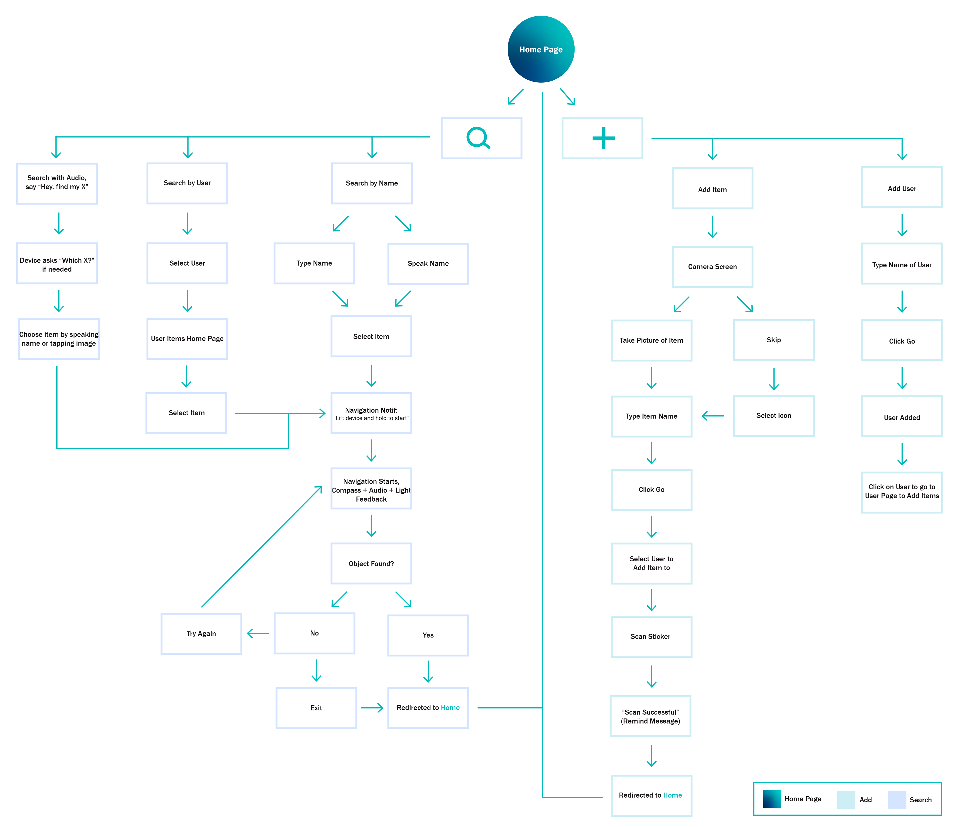
Updated UI Features
The first new feature I added was inspired by Siri and Alexa in the way the user can talk to them and ask them to perform a task. Based on my user testing and interviews, this was a feature that users would like to have in the device if they don't want to type the name of their lost item to find it, thus making the process faster.
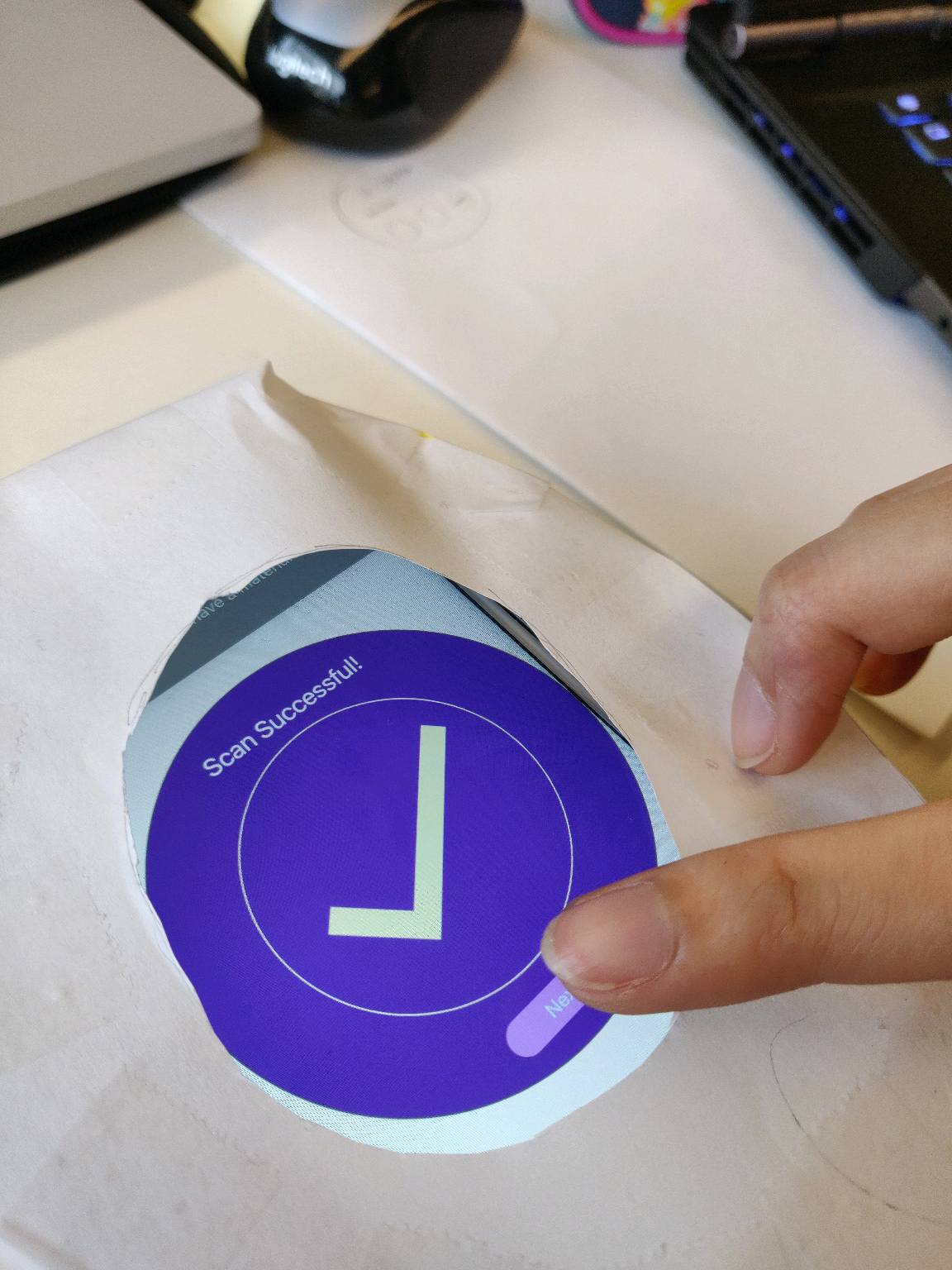
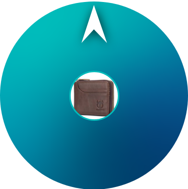
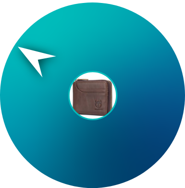
The user can speak to the device and say "Hey (Device Name), find my X". In this demo, the user asked the device to find their wallet. If there is more than one item registered with the name "wallet", then the device would ask "Which wallet?" and the user selects the one they're searching for and the navigation would start.
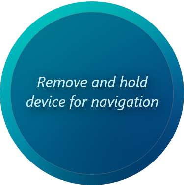
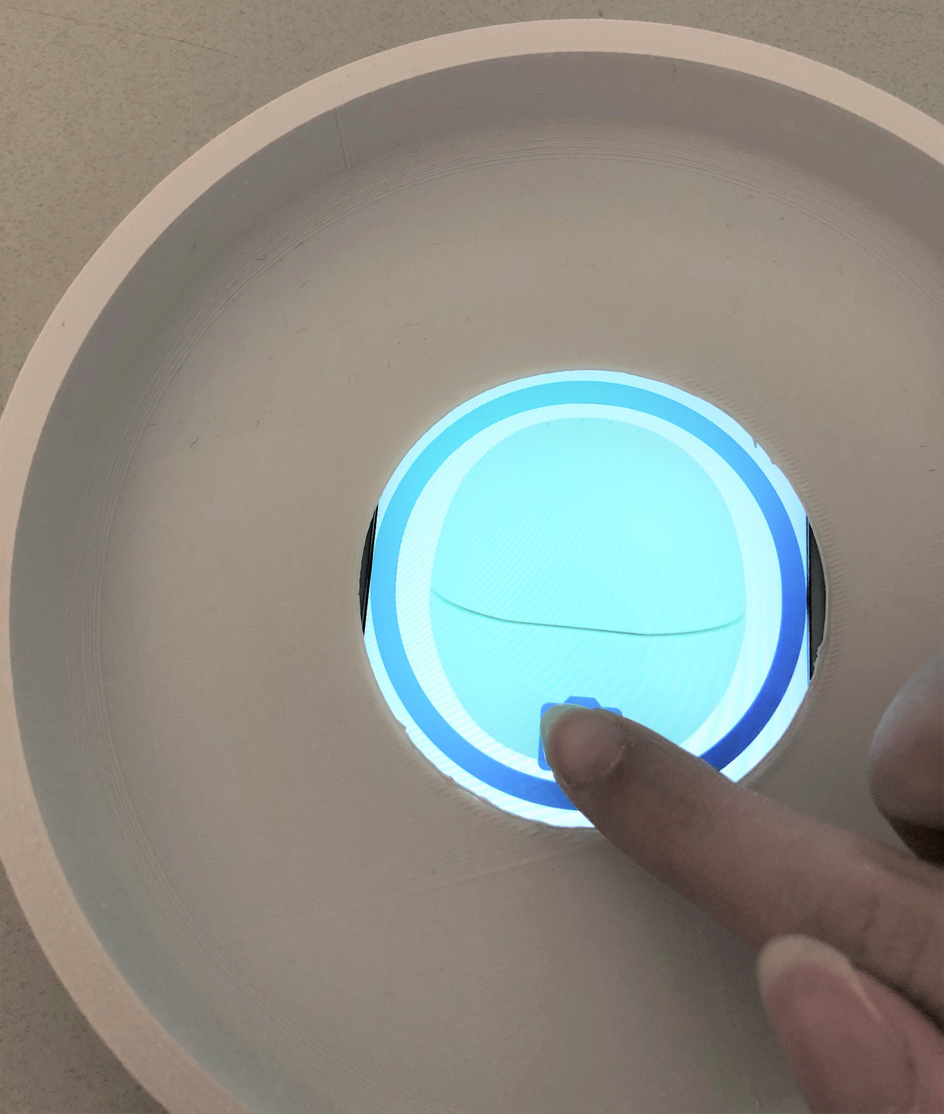
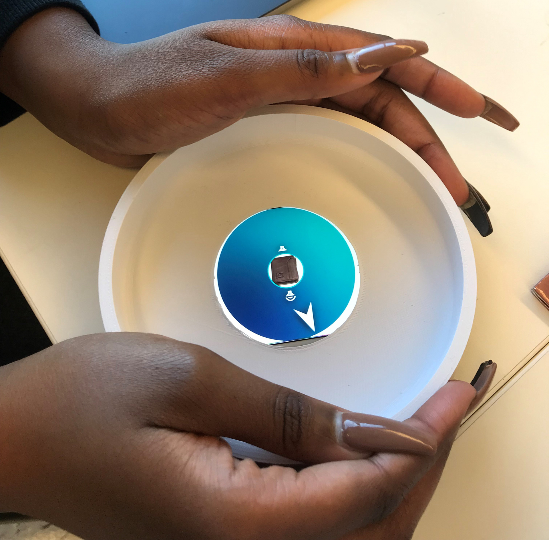
Next is the navigation part. To find the item using the compass and not just audio feedback, the user would hold the device and walk with it as it guides them towards their item.
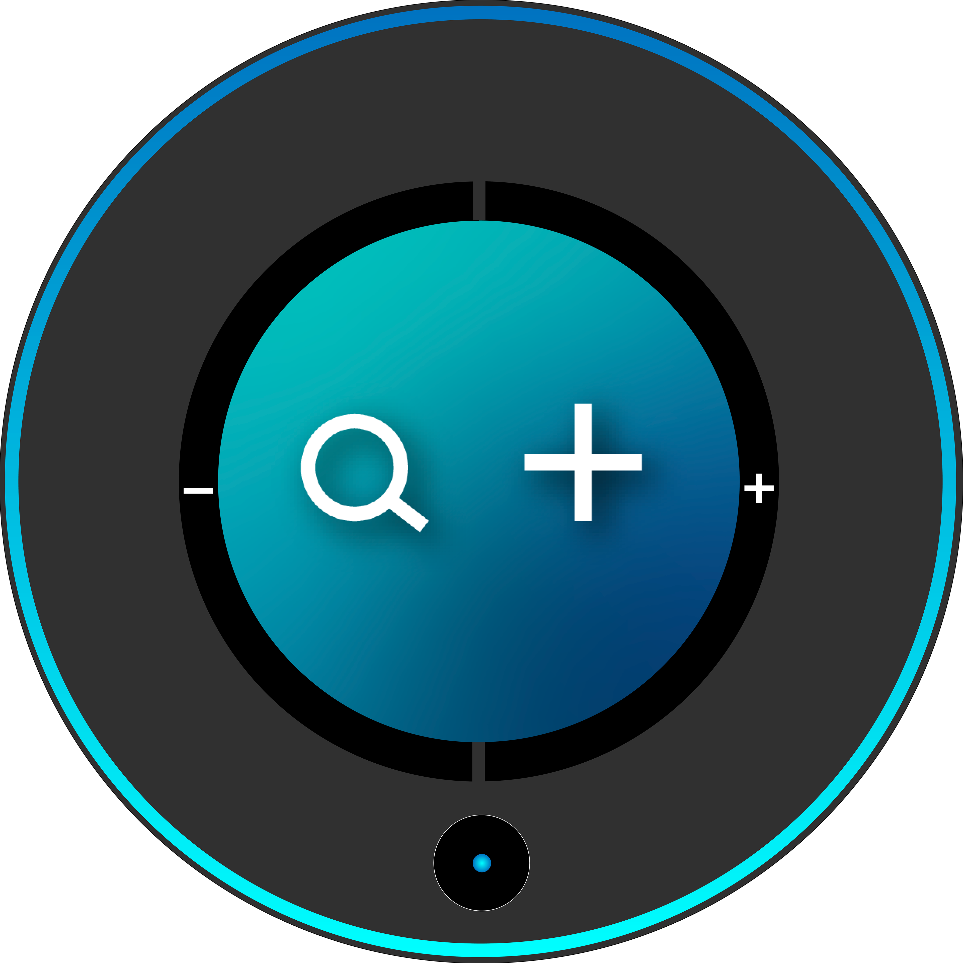
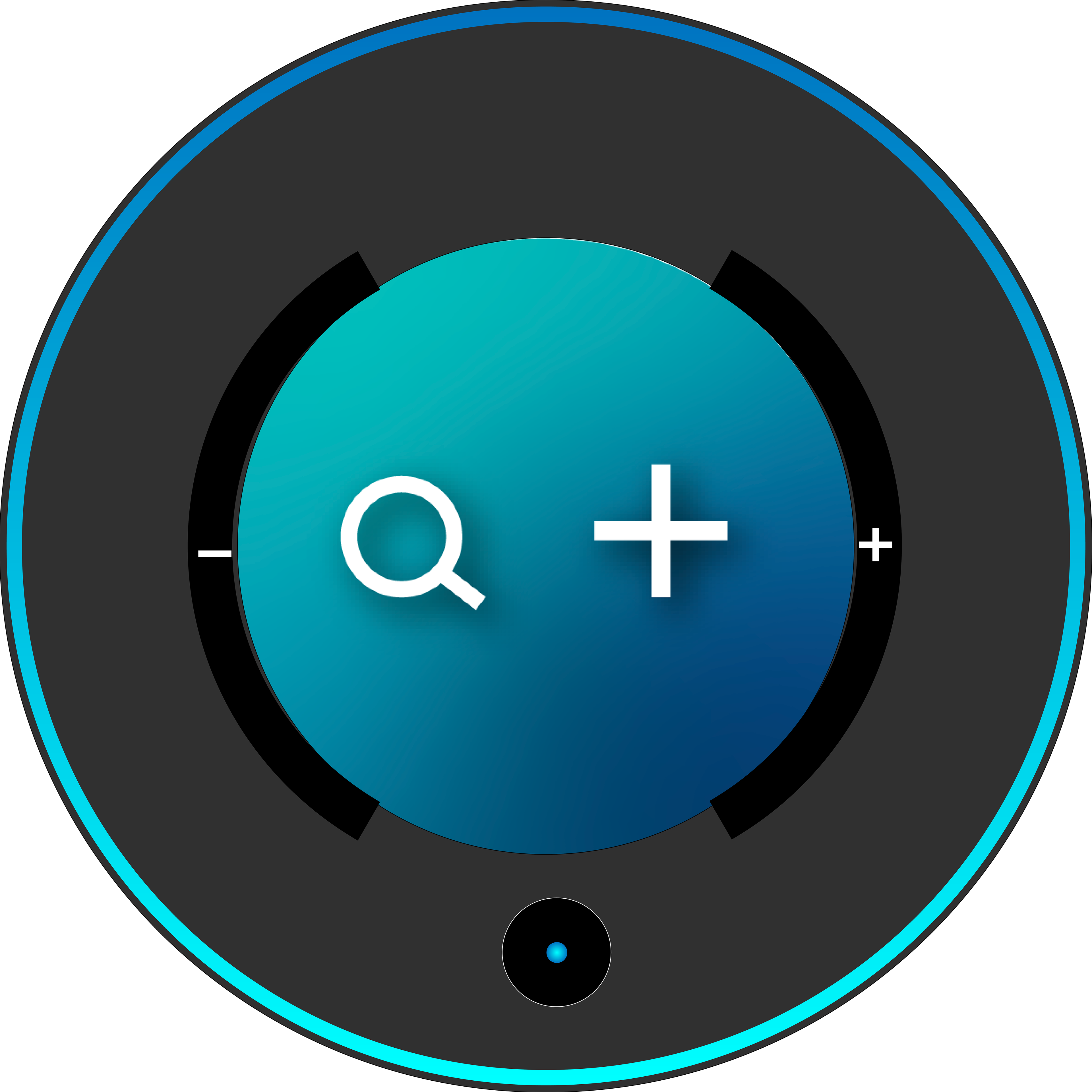
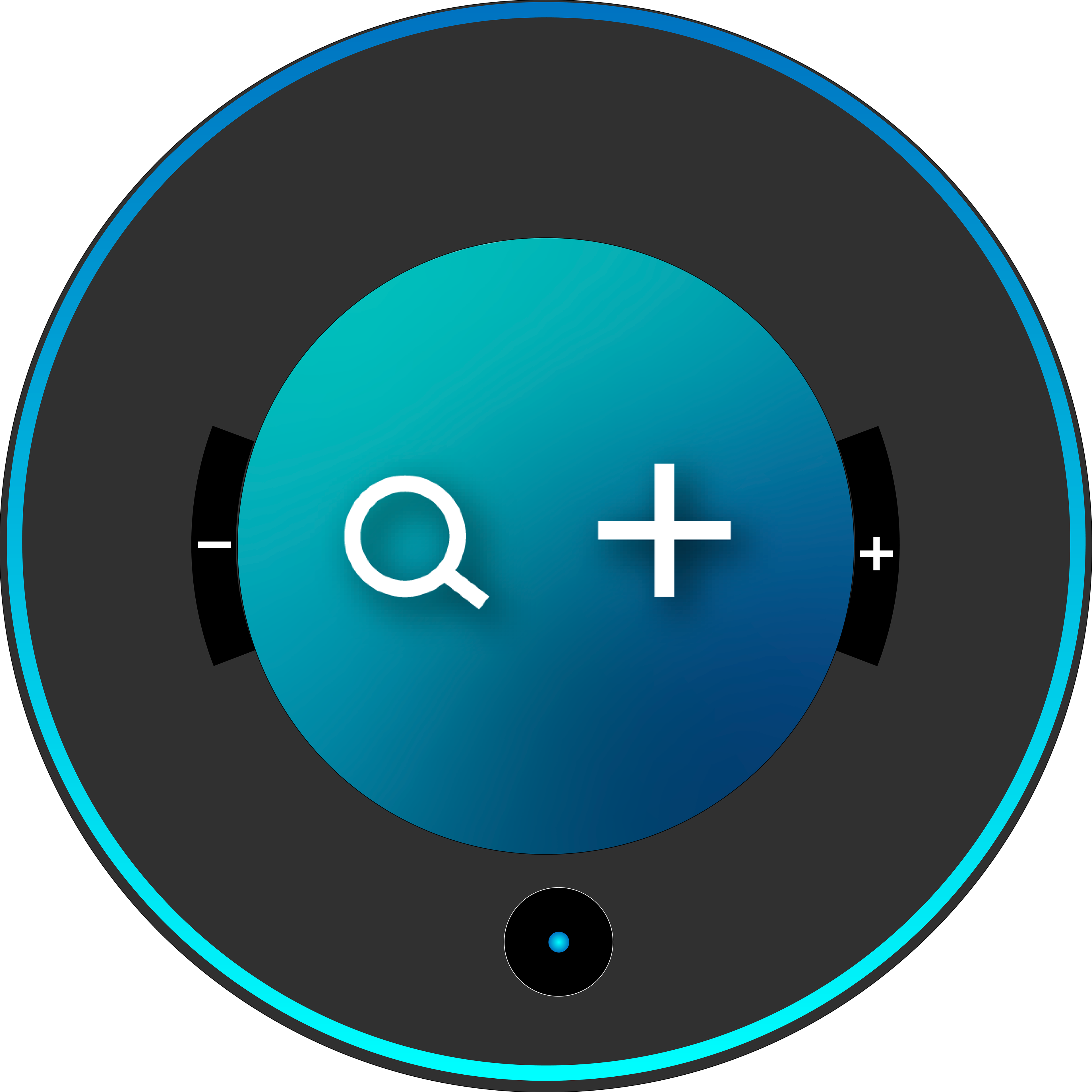
There are three forms of feedback to aid the user. First is the audio, which is the sticker beeping on the item. The second is the compass arrow that moves around in the direction of the item, and pulses faster the closer the user is to the item. And the third is on the physical device, which is a light ring that moves with the arrow.
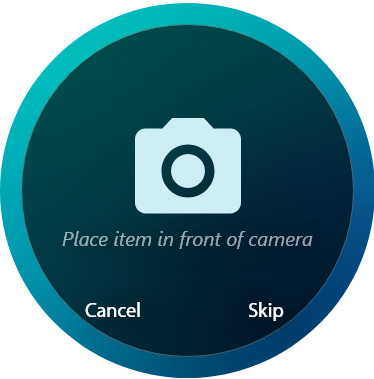
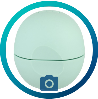
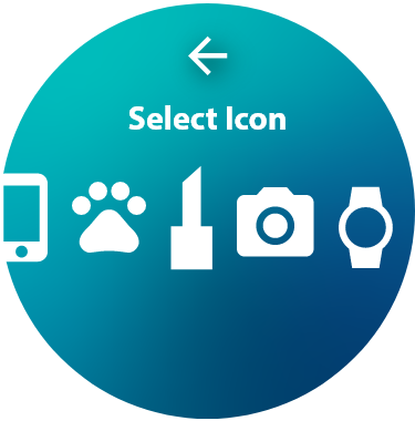
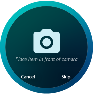
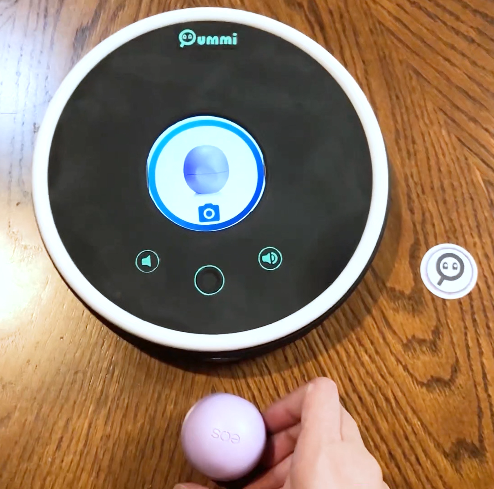
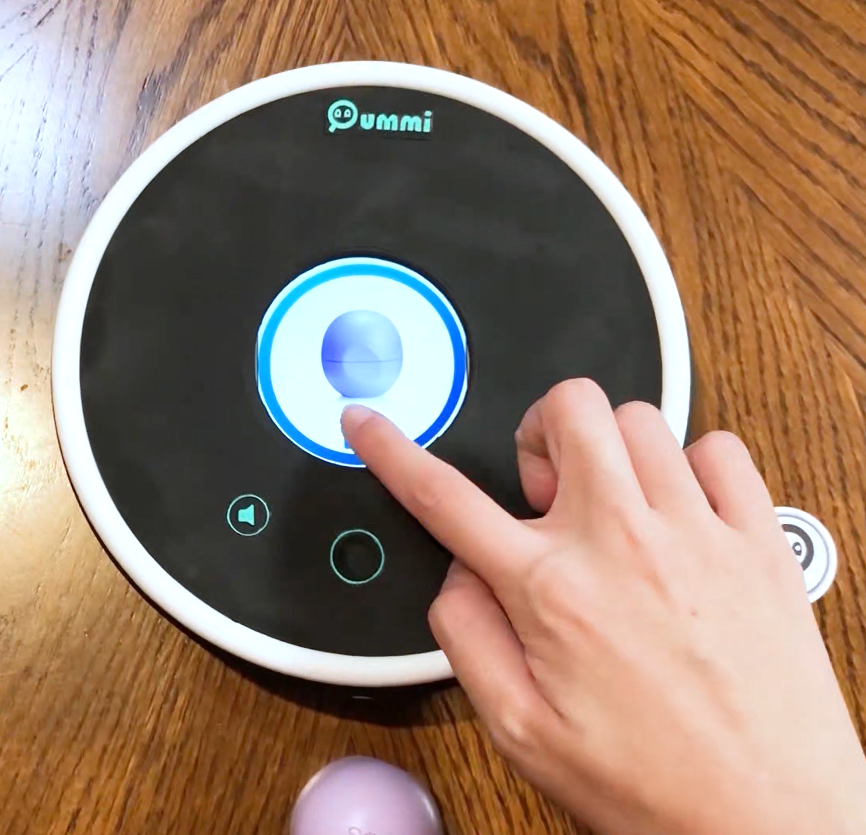
To add an item, the user has two options. One is to take a picture of their item with the device, and the second is to skip that step and choose an icon for their item instead.
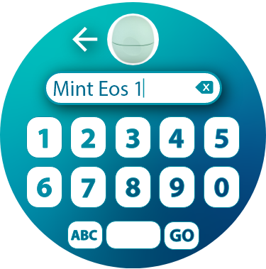
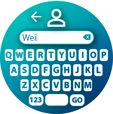
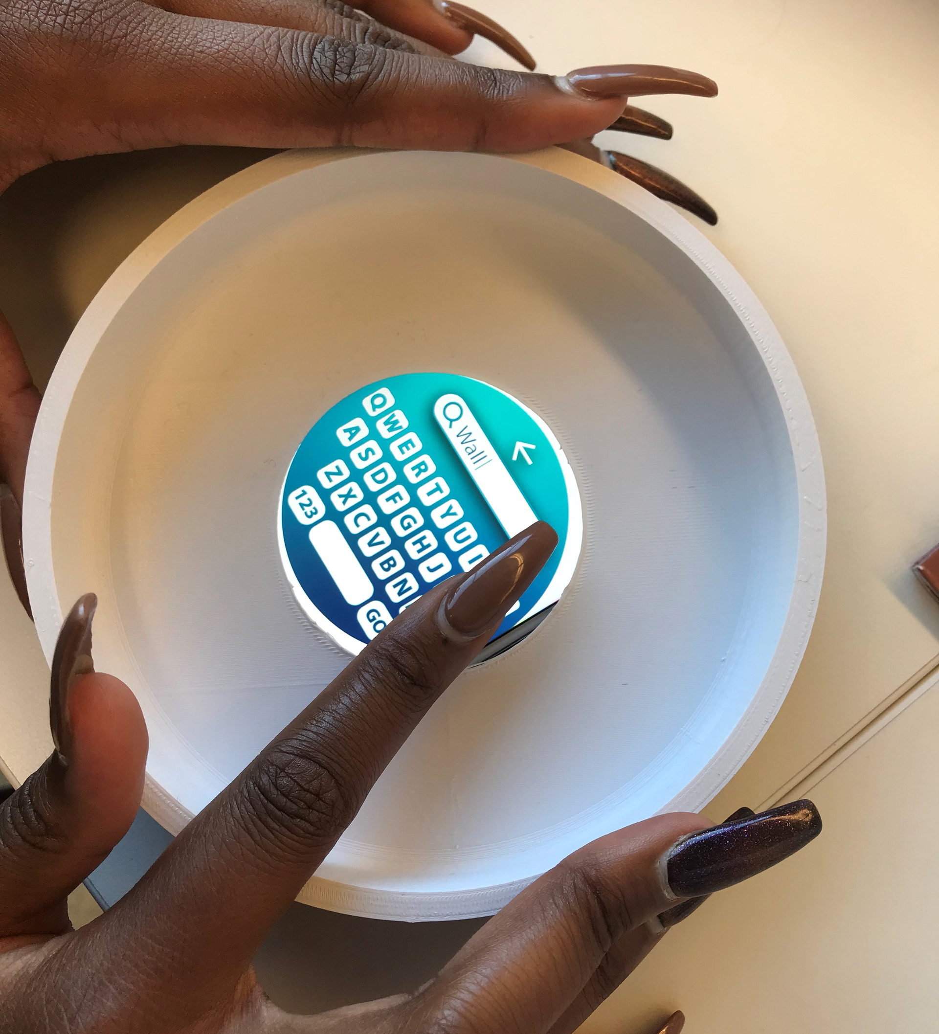
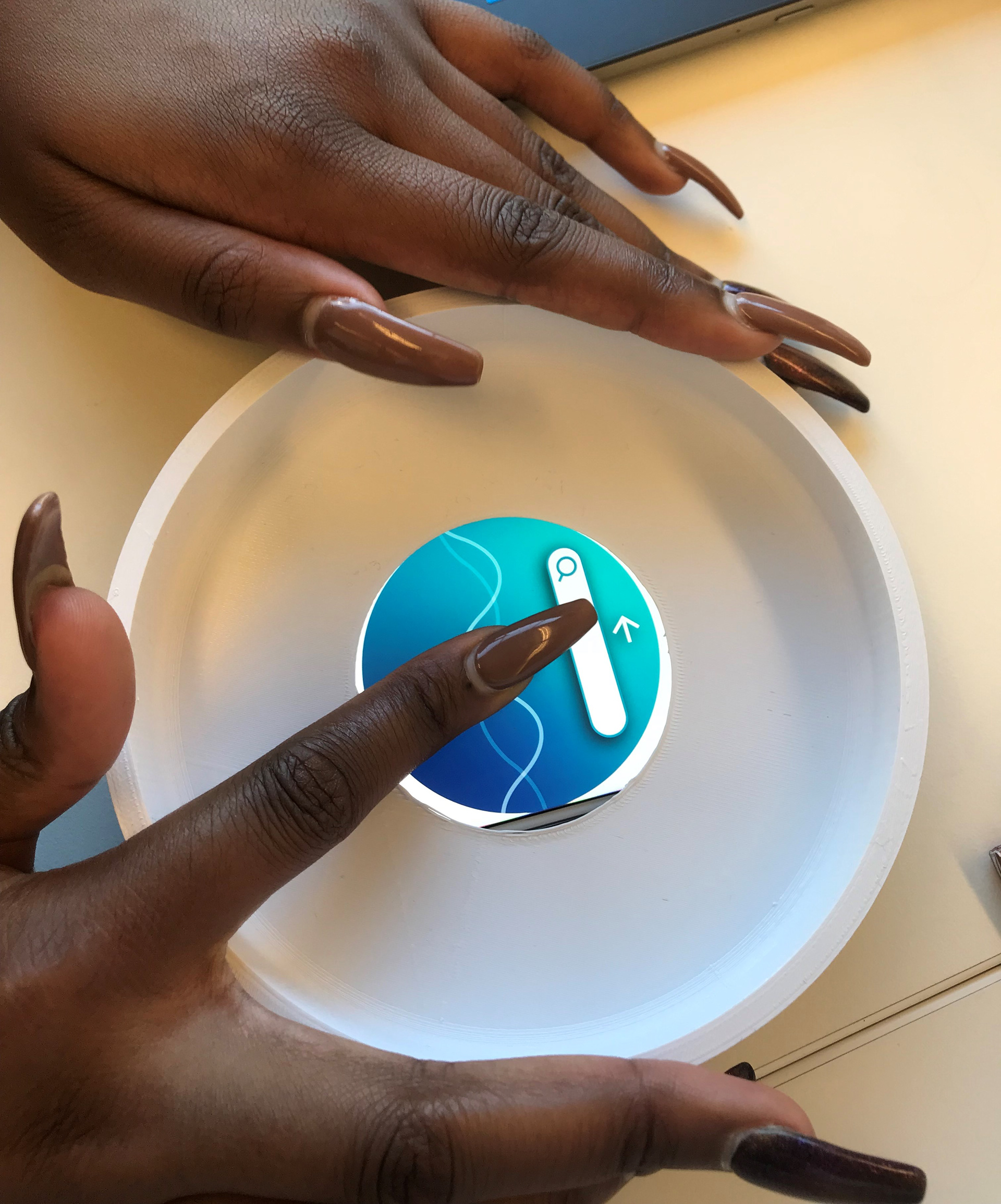
Another major change from the previous version is the keyboard. I used the same keyboard size found on a phone, and it's customized to fit the round screen better so that users can easily type words on the device.
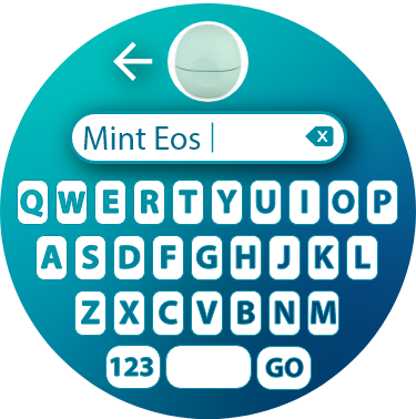
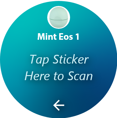
The step for adding an item is very similar to the first design. The user taps the sticker on the screen to scan it, then attaches it to their item. I eliminated the step of placing the item in a category since it was unnecessary, so the user now only has to selects which registered user they want to place the item under.
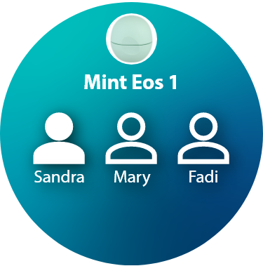
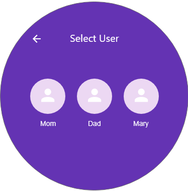
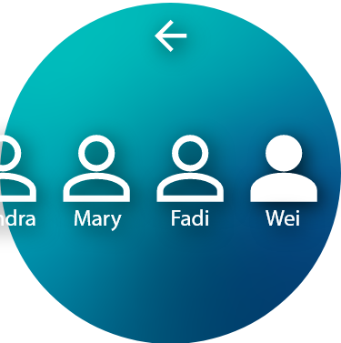
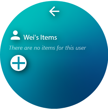
As for the step of adding a user, it very simple. The user will type their name, and then they'll see their icon on the Users page. To access their registered items and add some more, the user would select their name and see the content of their page.
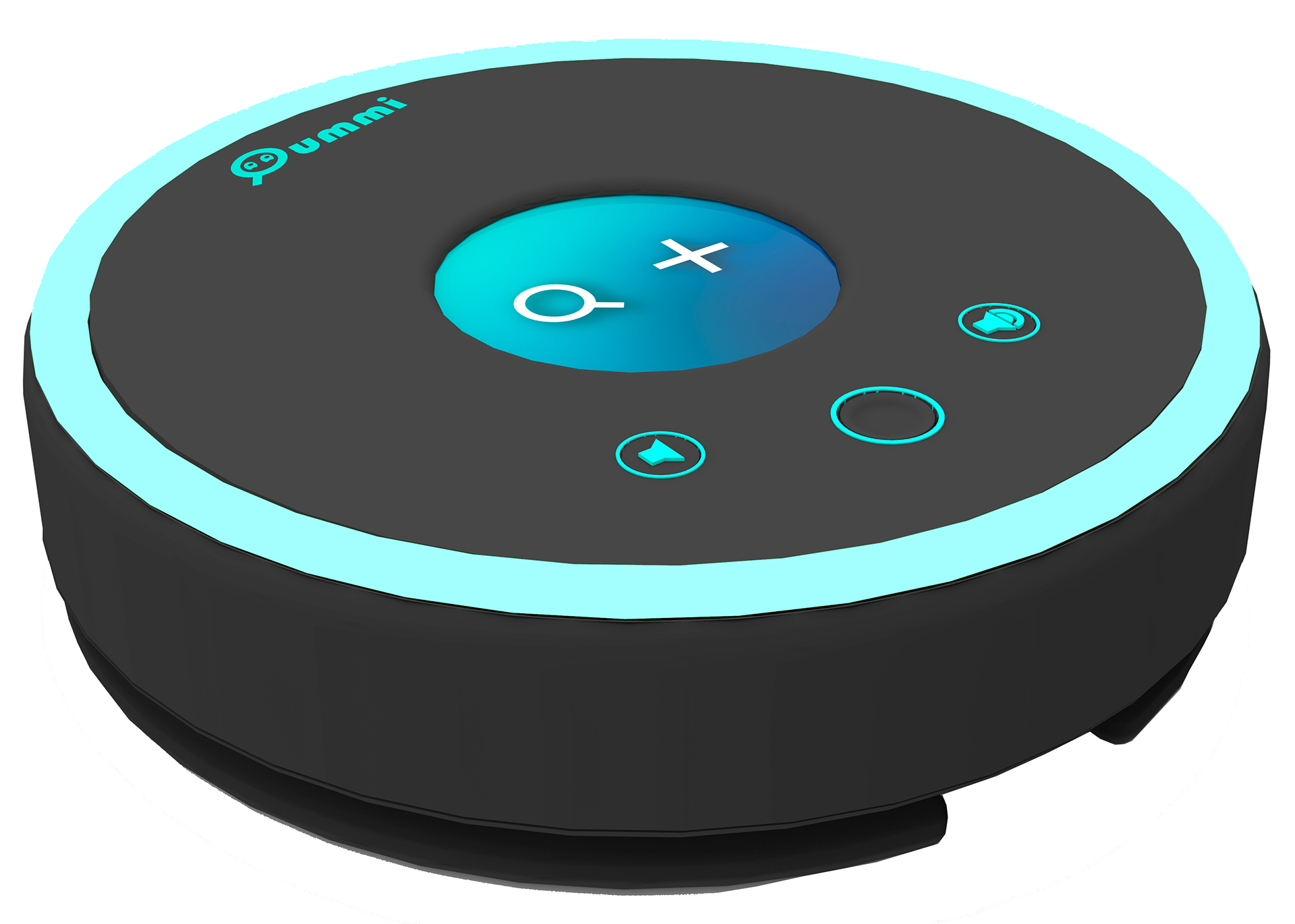
Physical Device Form Development
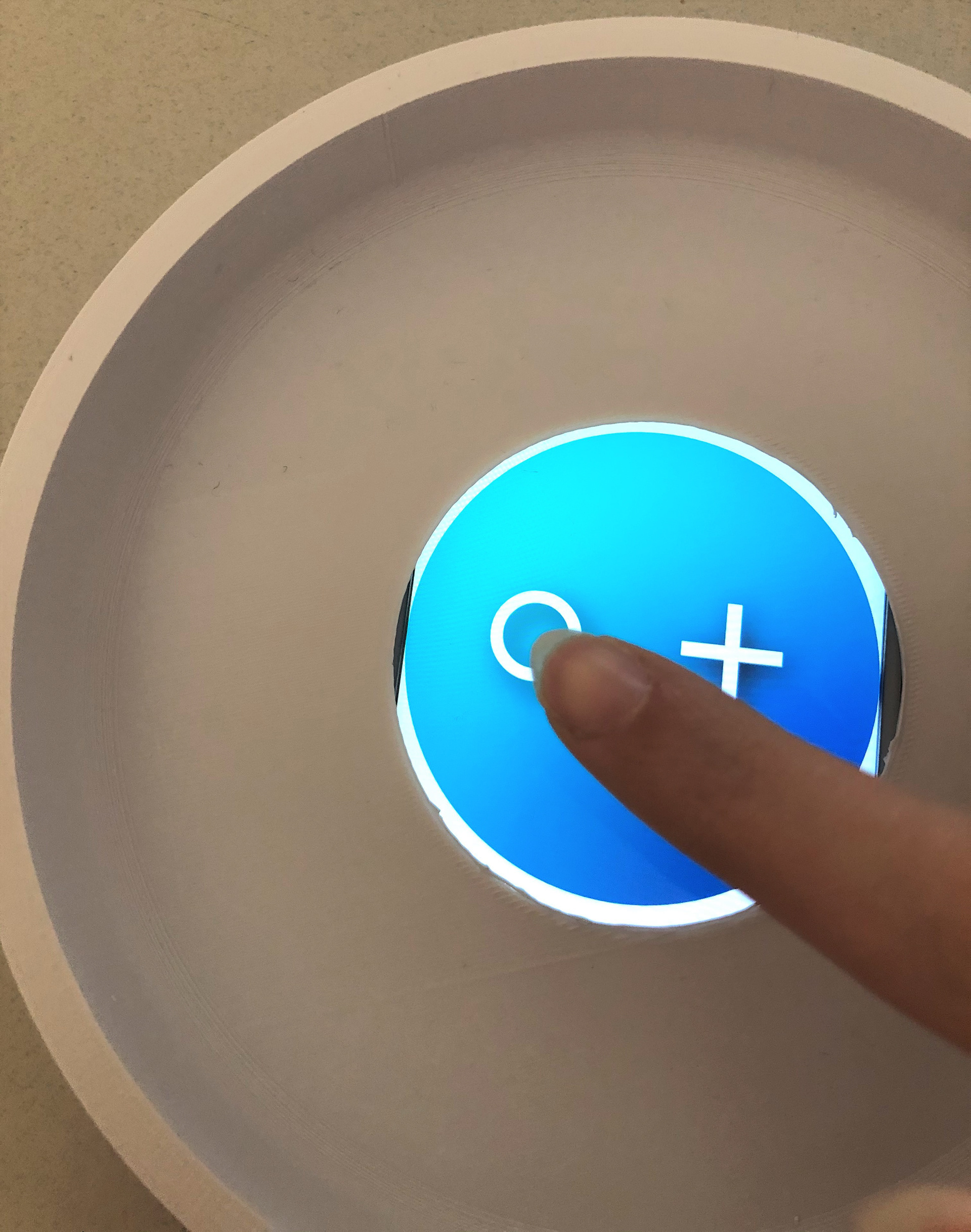
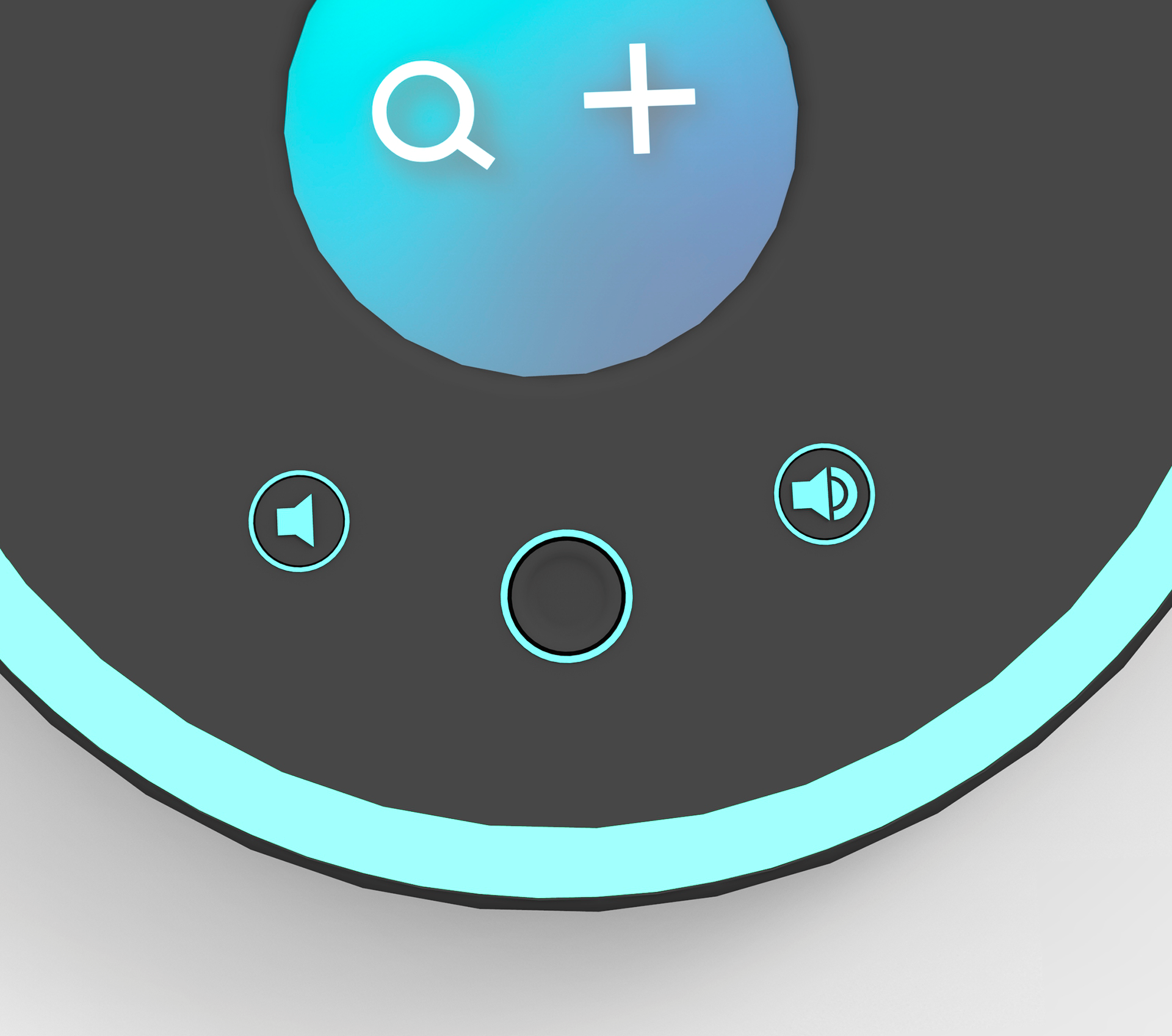
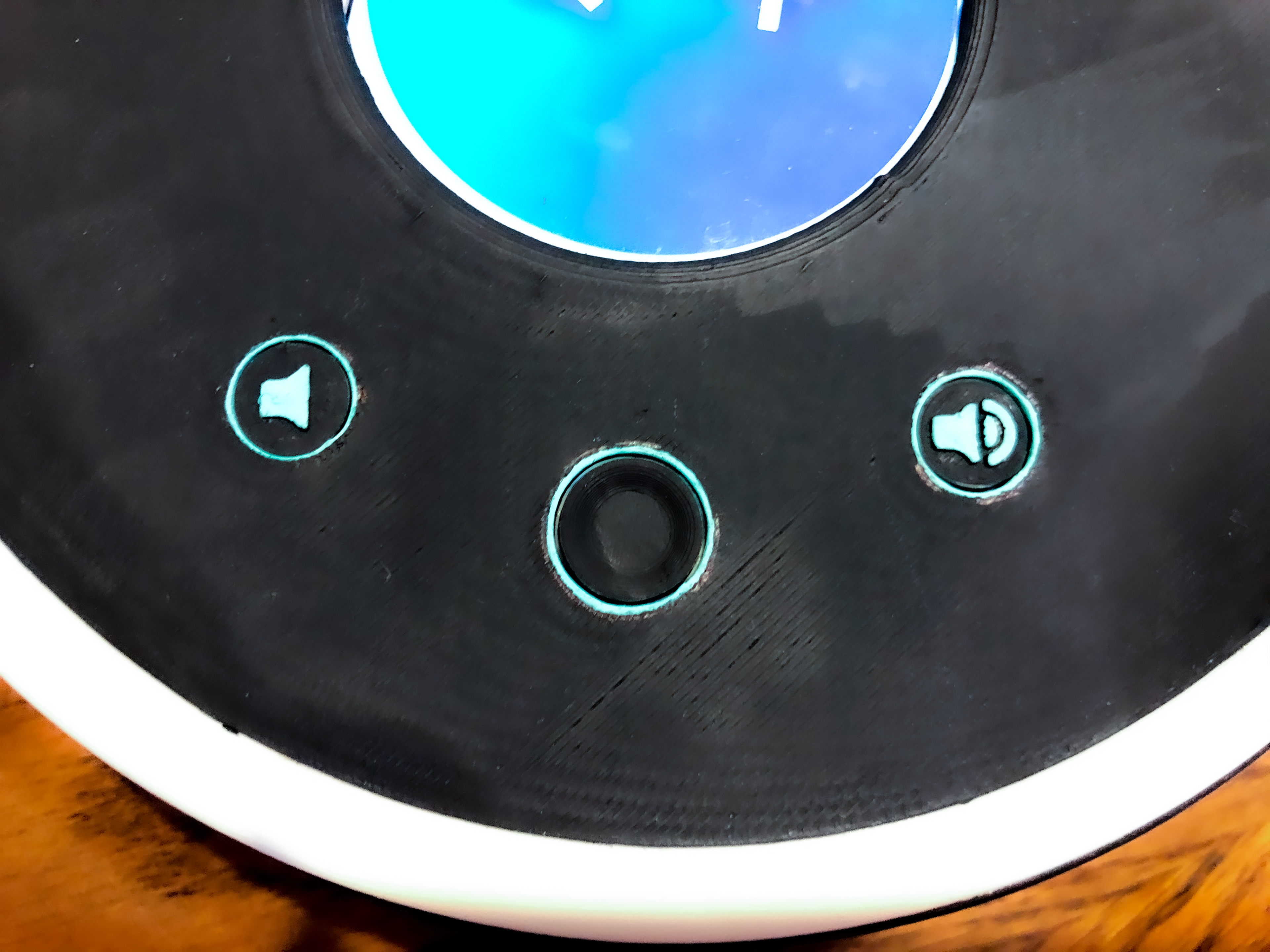
The physical device went through a few iterations to determine the placement of the three main buttons. Users wanted the physical device to be simple with as few buttons as possible, so this device only needs three buttons that might not always be utilized. The primary button is a Home button at the center to help the user get to the home page quickly from whatever screen they're on. And the other two are volume control buttons to lower or increase the volume of the beeping sticker as needed.
Out of the five design options I presented, my audience choose the one on the right since it provides the without accidentally pressing them
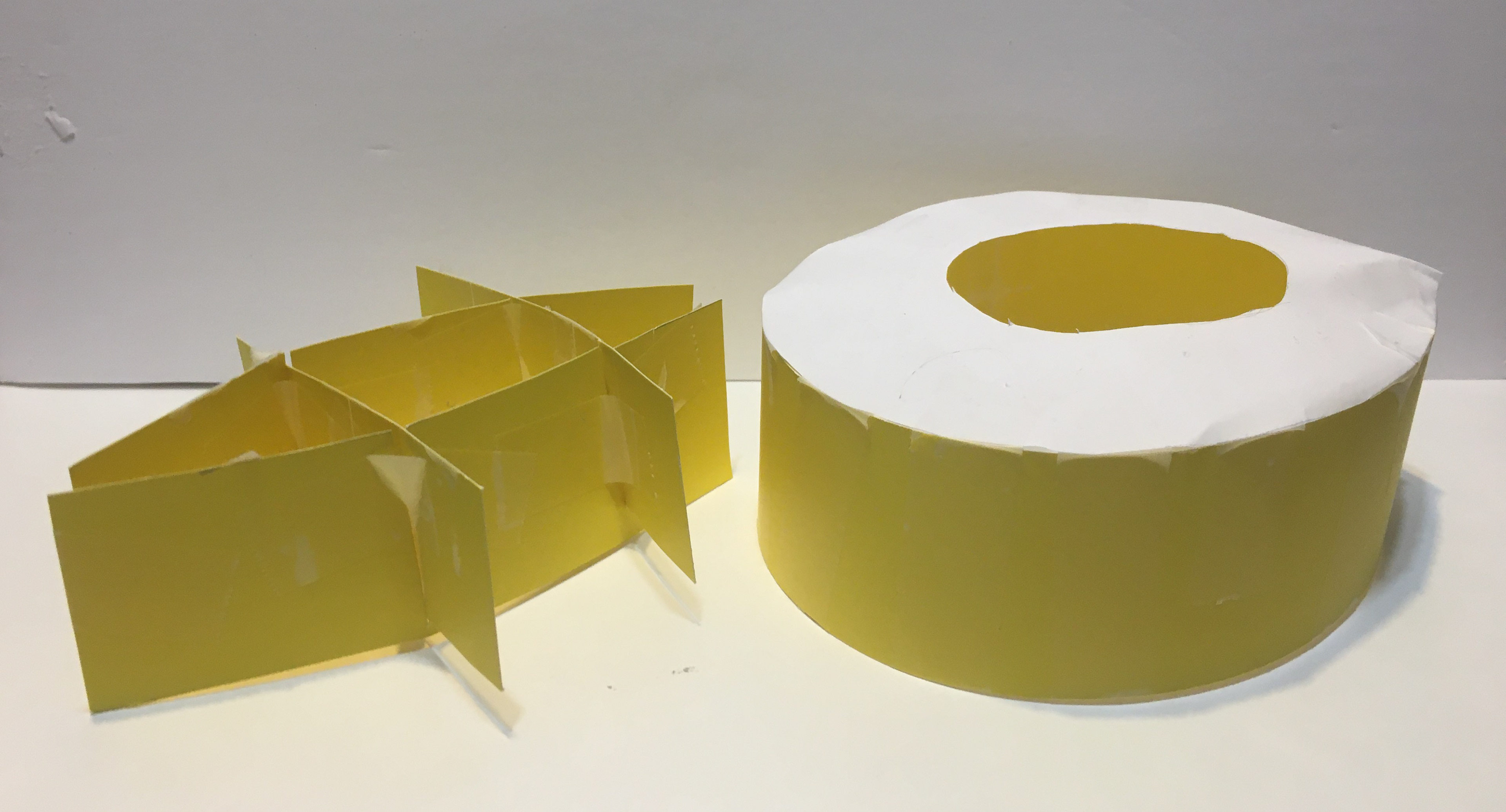
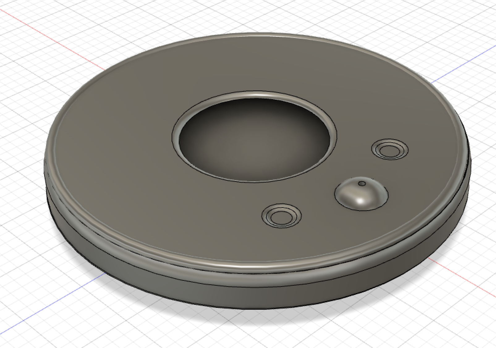
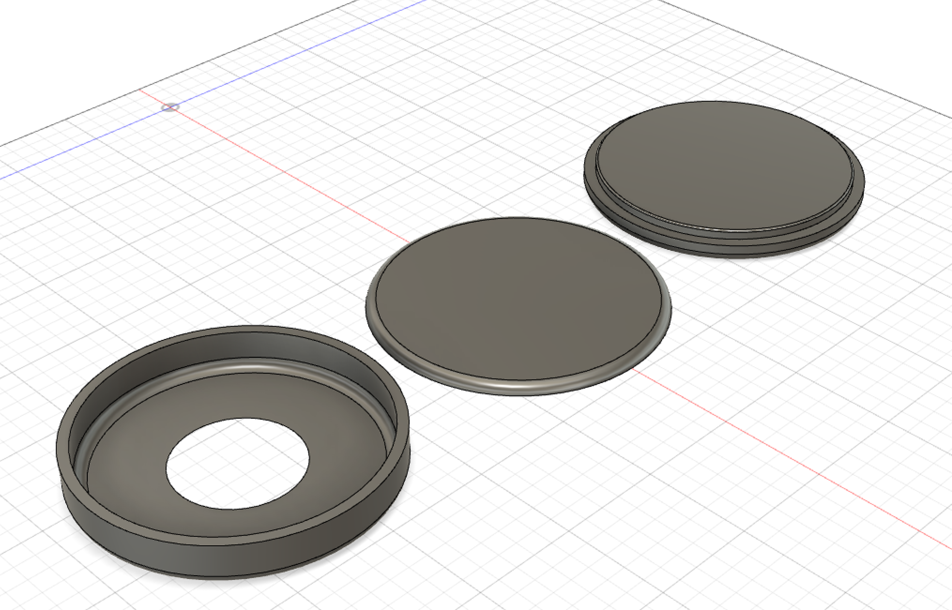
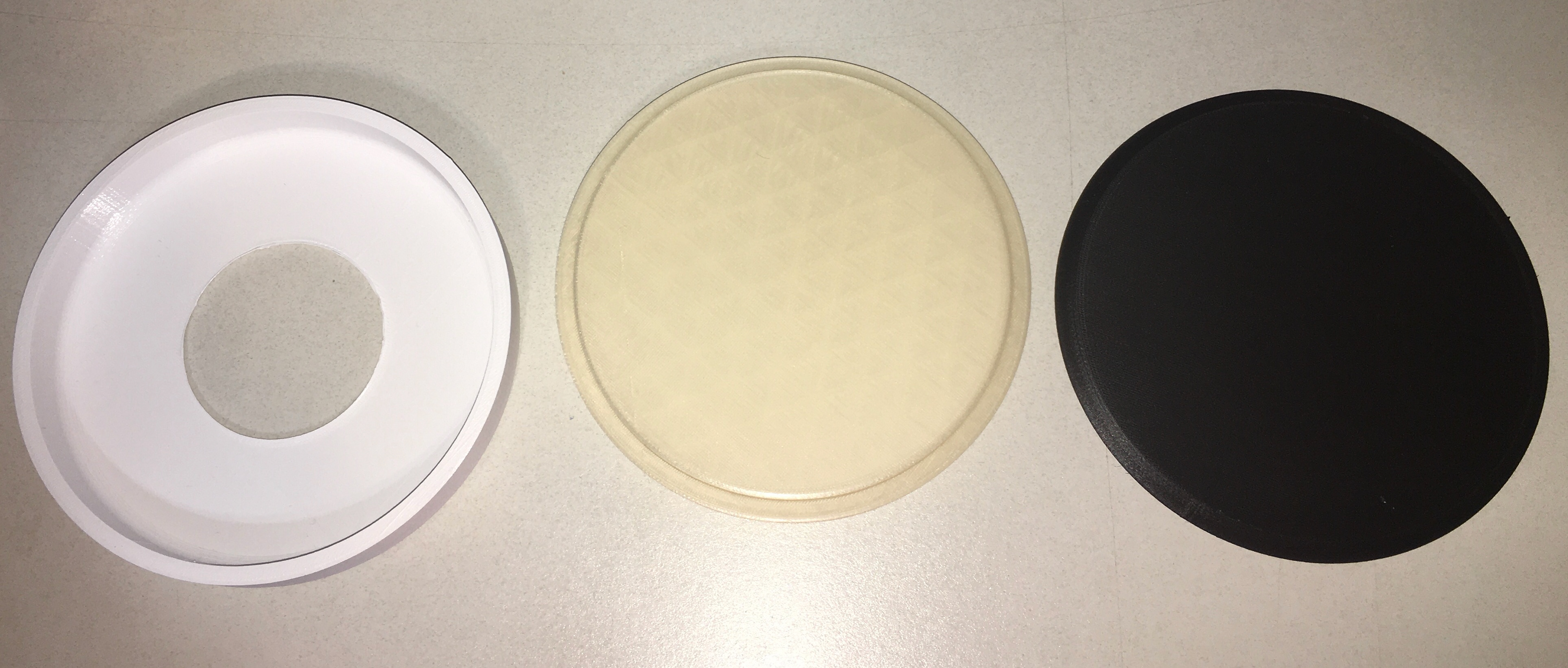
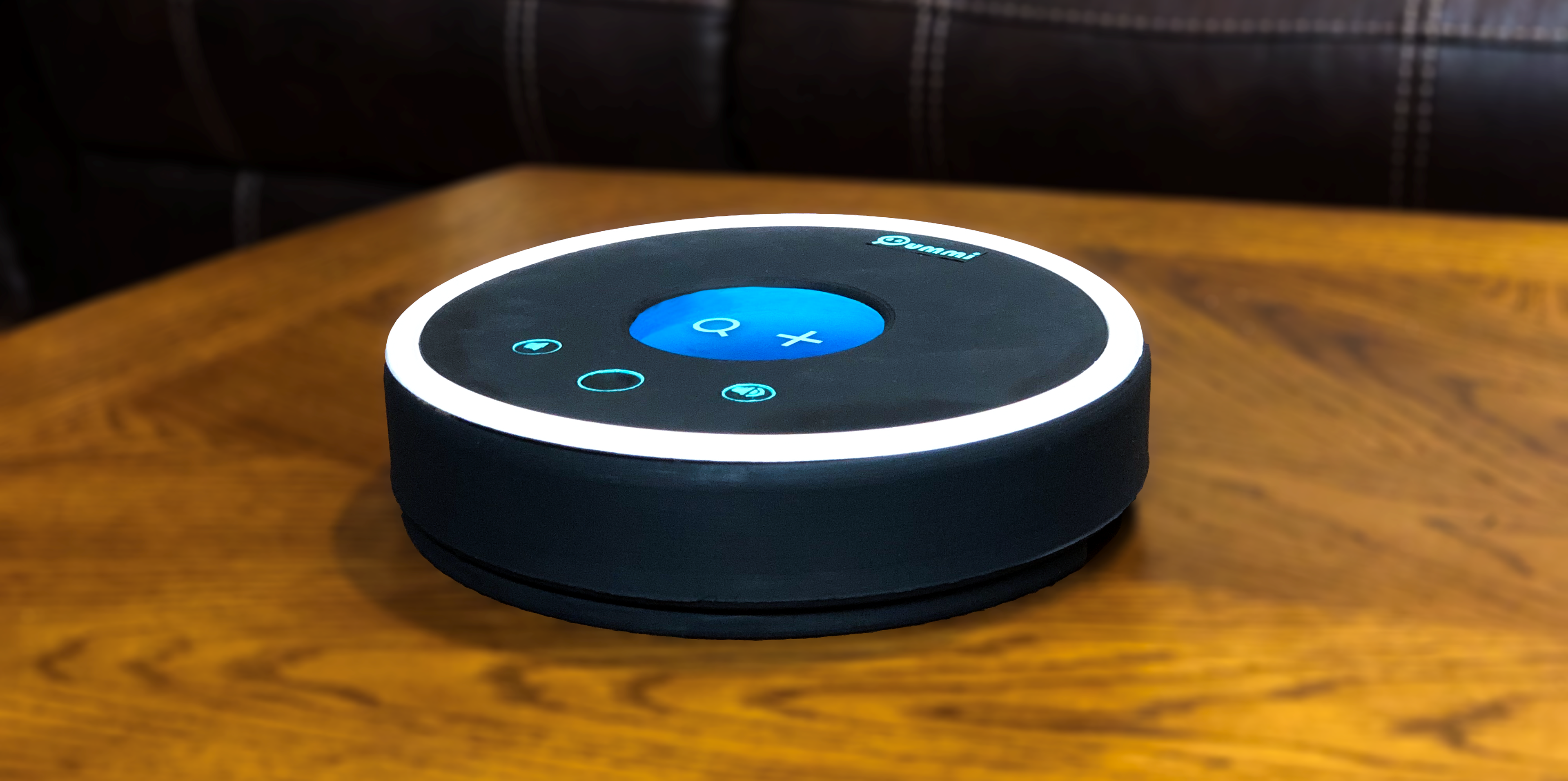
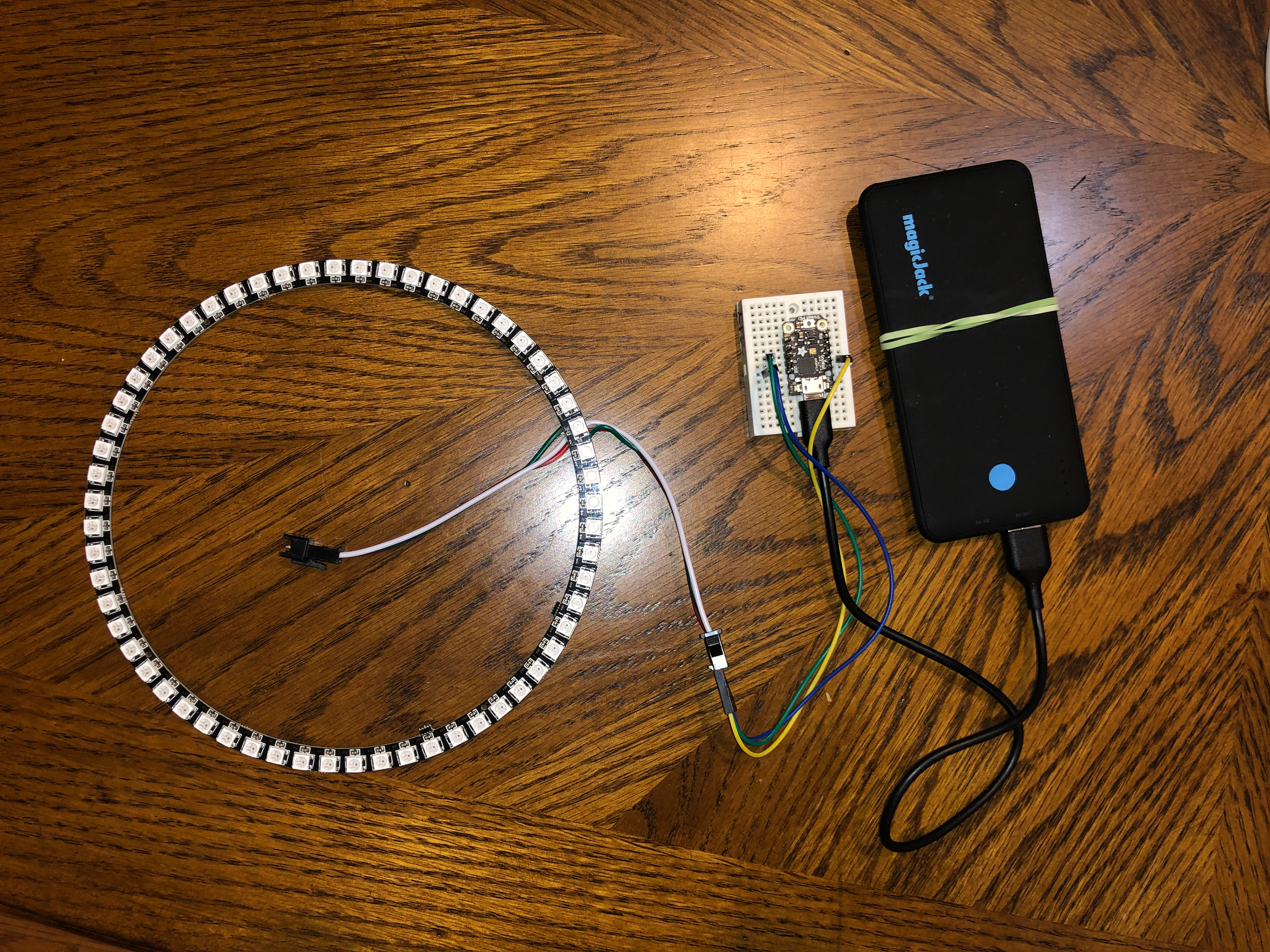
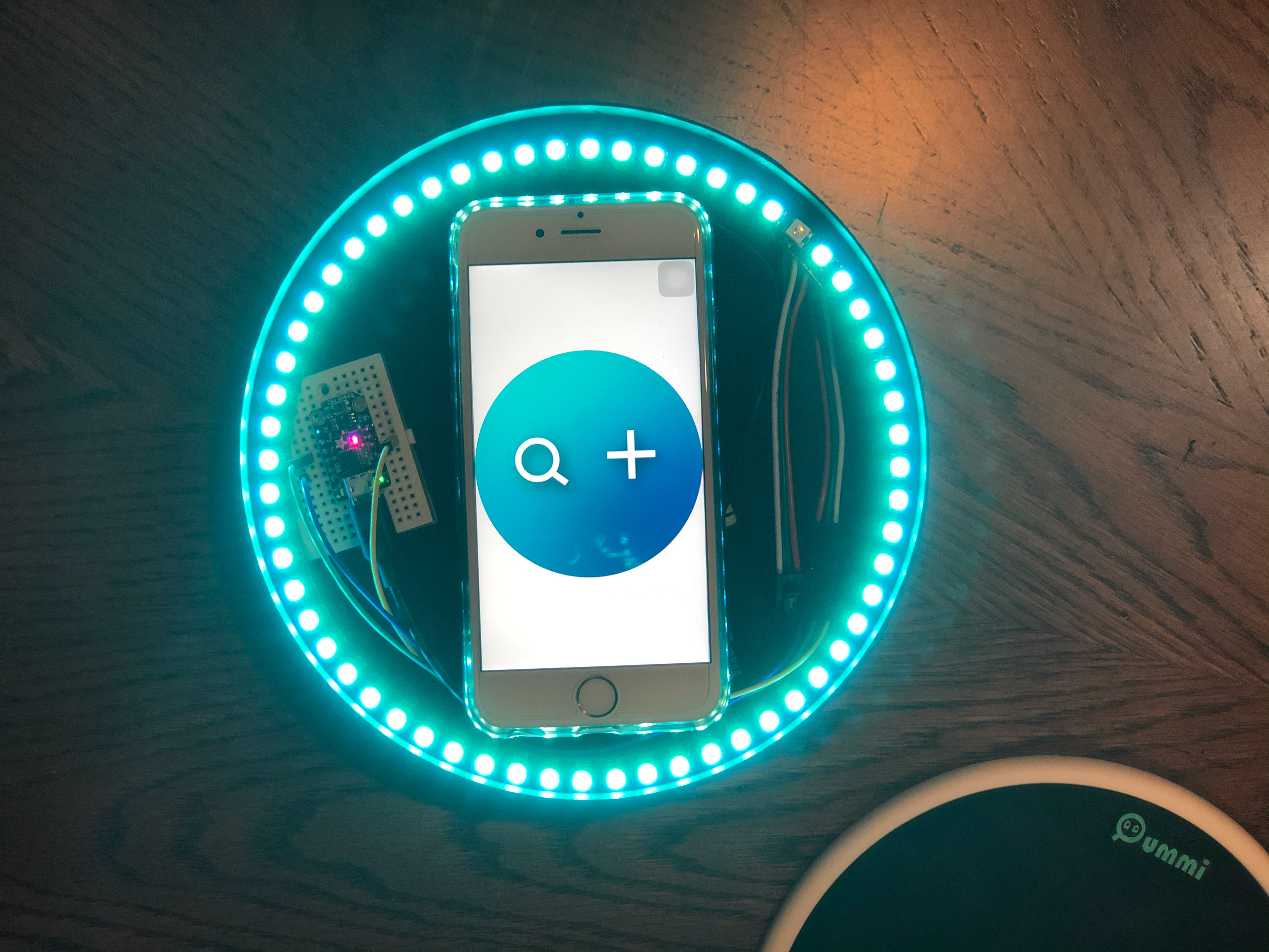
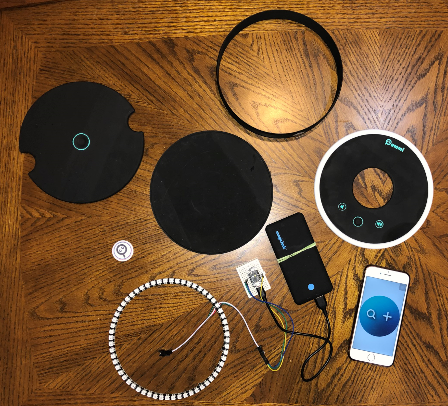
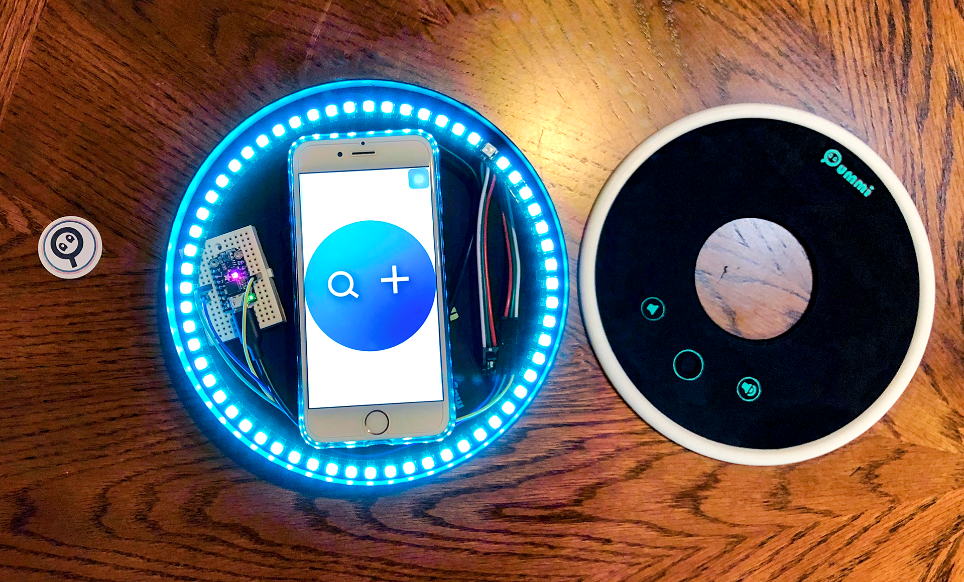
Using Fusion360 I created a 3D version of the physical device that was later 3D printed for user testing.
The device comes in three parts. Two to hold the technology in them (a bottom piece and the lid with the round hole and buttons), and a base piece that is a wireless charger for the device.
For the purposes of this project since I couldn't use a real round screen, my phone is the one that goes inside the device, along with a mini circuit board to control the light ring.
User Testing & Feedback
Due to a miscalculation on my part, the phone containing the interface did not fit properly inside the 3D printed device, and thus my users had to flip the lid and test it that way instead. They were still able to get an idea on how the device would look and feel, but the feedback was mostly focused on the user interface and interaction.
Feedback
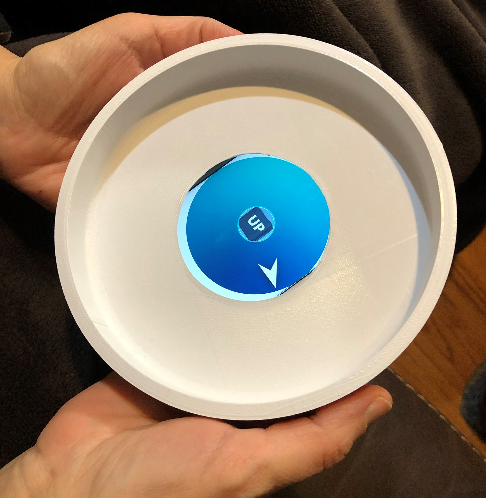
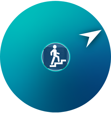
● I added a hover text on the navigation screen that pops up on top of the item image that says "up" to let the user know they need to go upstairs. All of my users found this more confusing. They didn't know if this meant the item is high on a shelve or if they should raise the device up instead. This should be changed to be more clear.
● The typing pad is still small.
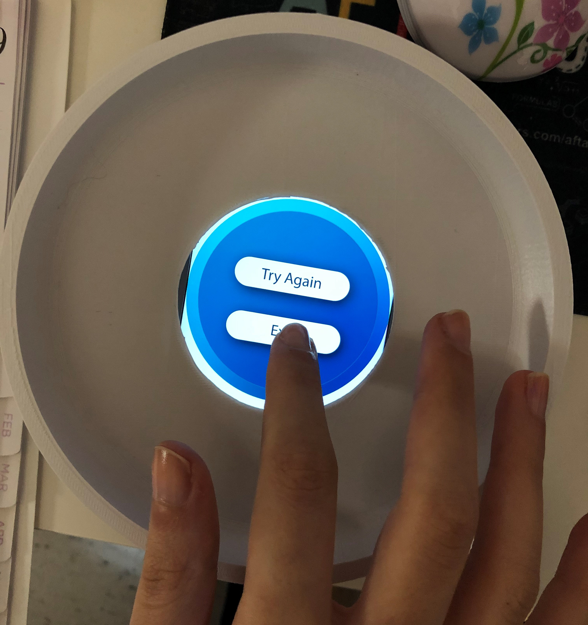
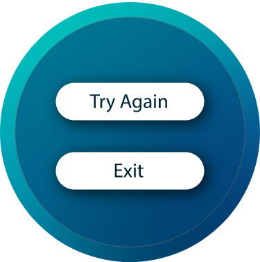
● There should be a way for the user to exit the navigation while it is still going.
● Where the "remove device to start navigation scree" should stay for a bit longer and disappear on it's own once device is lifted.
● The base piece could serve a purpose in addition to charging. Maybe if it can have a button so that if device gets lost, user can press that button to make the device beep and locate it.
● Save the user time by eliminating some of the double tapping, and let a screen go to the next automatically after one tap.
● Make more use of audio and let the user speak to the device when writing names without having to press and hold a button.
● Overall UI is easy and intuitive, but it can still be made even simpler by letting the device do more work for the user.
Next Steps
1. The “up/down” cues were confusing for everyone without an explanation from me. I should figure out the best way to represent vertical distance in a neat manner.
2. The overall flow works well for everyone who tried it, but it would be preferable to have a fewer steps and eliminate some buttons/ taps to make the process faster and less confusing.
3. Due to my calculation error, users could not fully experience what the physical device would be like, nor did they get to try the light ring I plan to add. Therefore I need to get some more feedback to figure out what the exact function of the light ring would be beyond aesthetics.
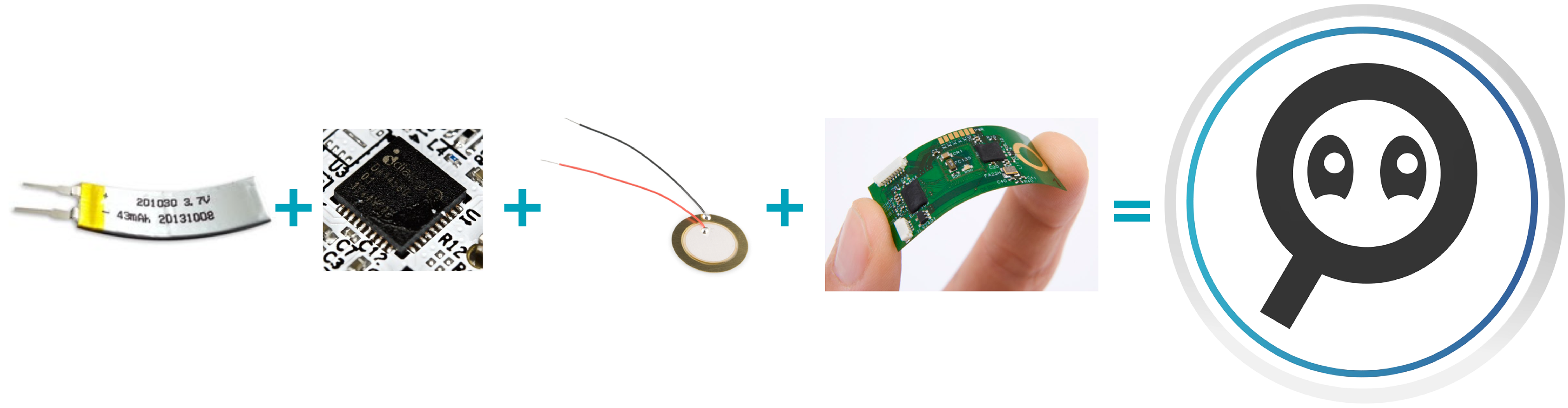
4. The sticker has not been tested yet. Although the sticker is not the primary focus of the project and I won't be able to make a working model, I need to do more research to learn what technology would go inside the sticker to make it function.
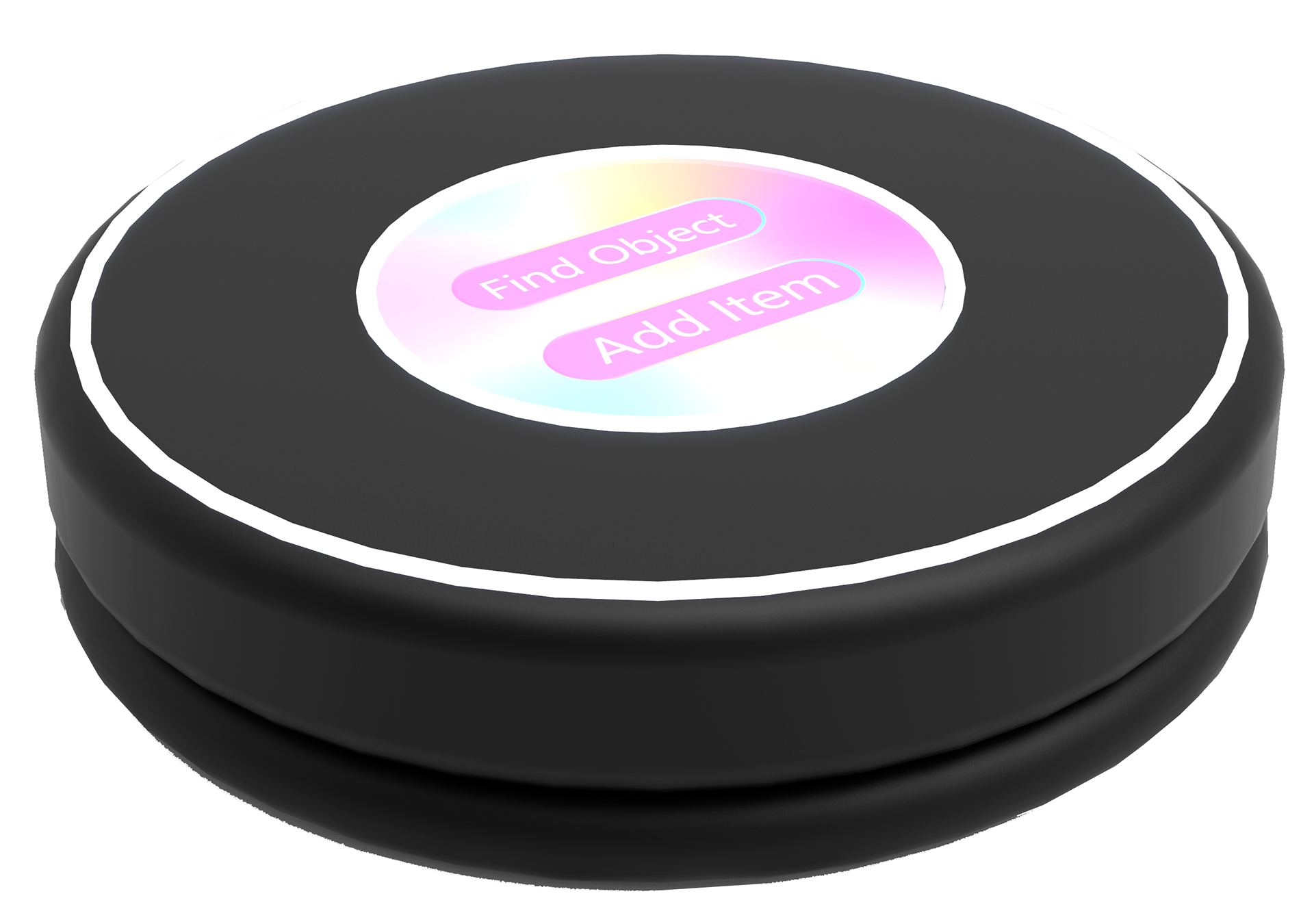
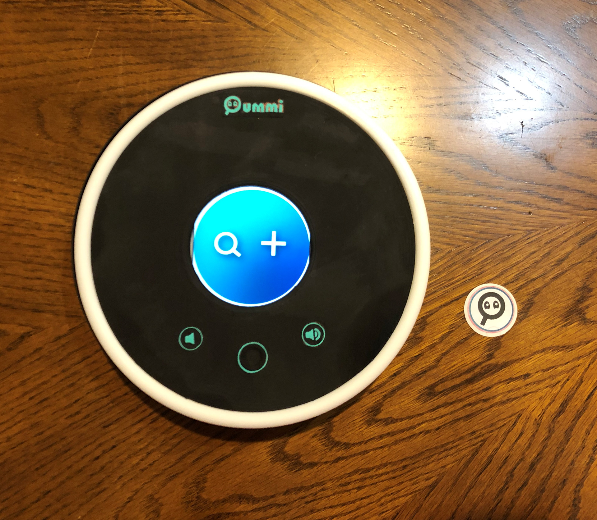
FINAL DESIGN
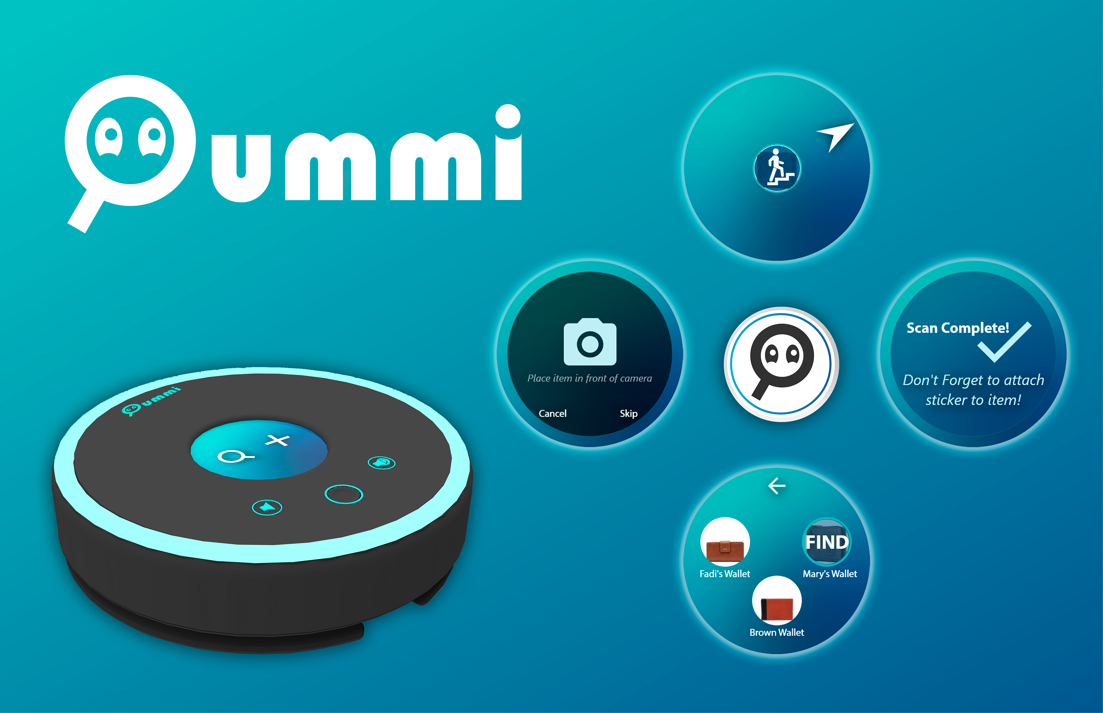
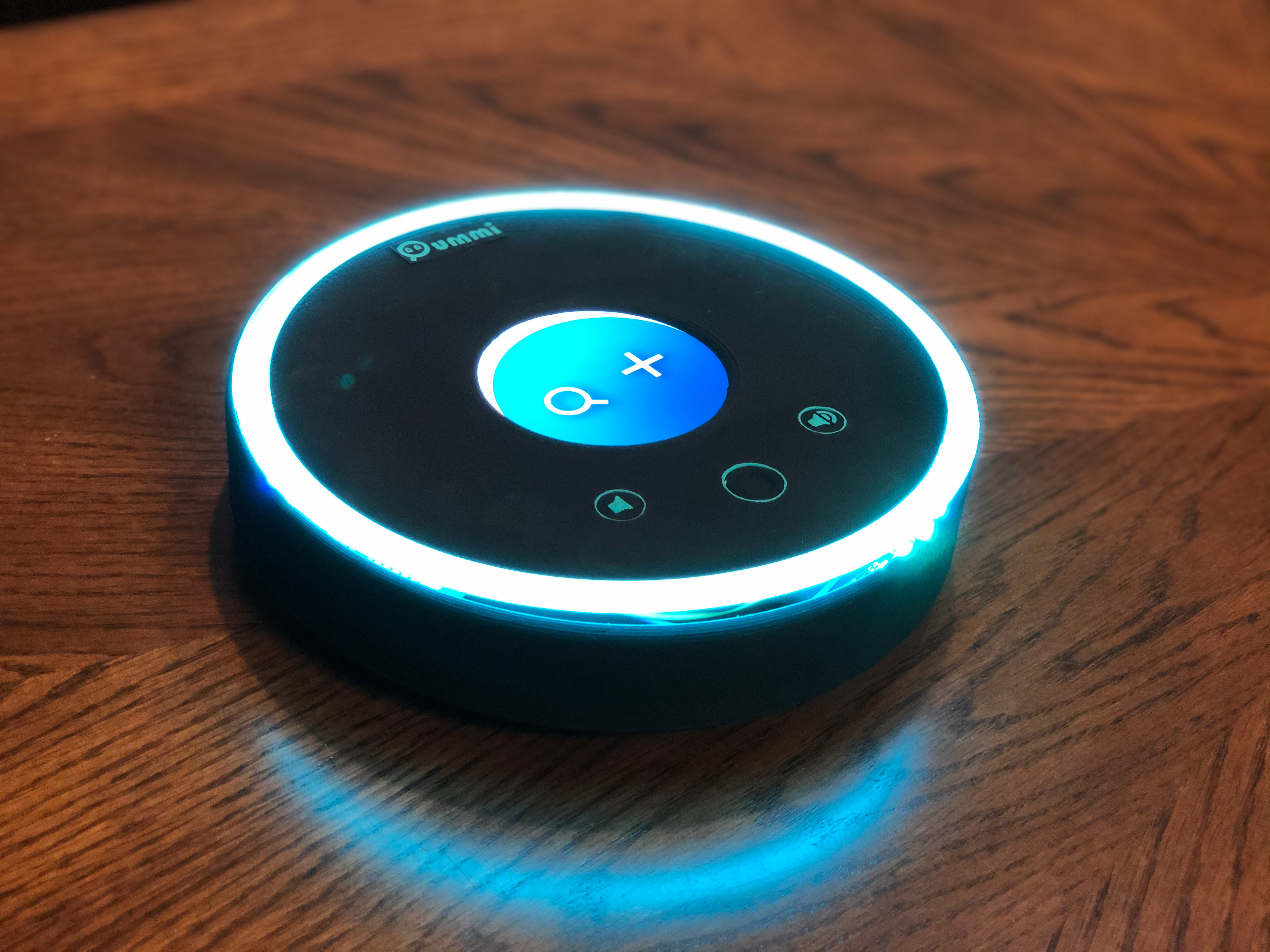
Introducing Oummi
Oummi is a smart home device that helps users find their lost/misplaced items at home, and it can be used by multiple people living in the same household. The goal of this device is to aid with the struggles of finding a misplaced item by making the process easier and faster. Simply add a sticker to the items you tend to lose the most, and now whenever they're misplaced around the house again, Oummi will help you find them.
The device has three main components: Physical Device, User Interface, and Smart Sticker

The Name: Oummi
Oummi means "my mom" in Arabic, and it is typically the word a person would use when calling their mother.
Since Arabic is my first language, I decided to give the device this name for a very specific reason: Legend says that moms have this supernatural superpower that allows them to find any lost item (except their own). Since this device helps people find their misplaced items around the house, Oummi was the perfect name.
And thus, the product's name and logo was born

How does it work?
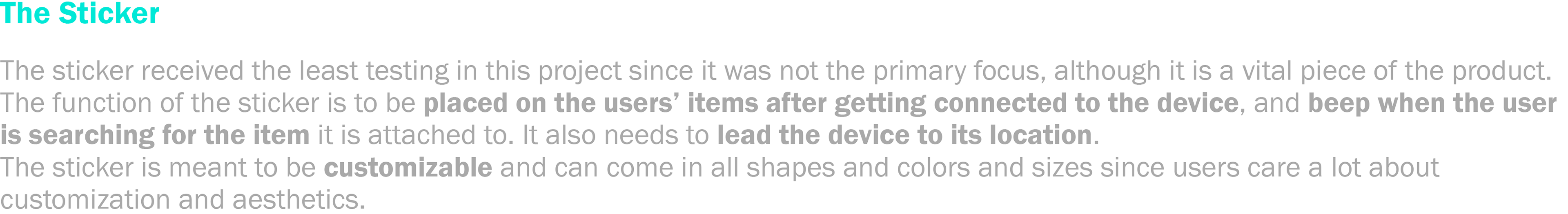
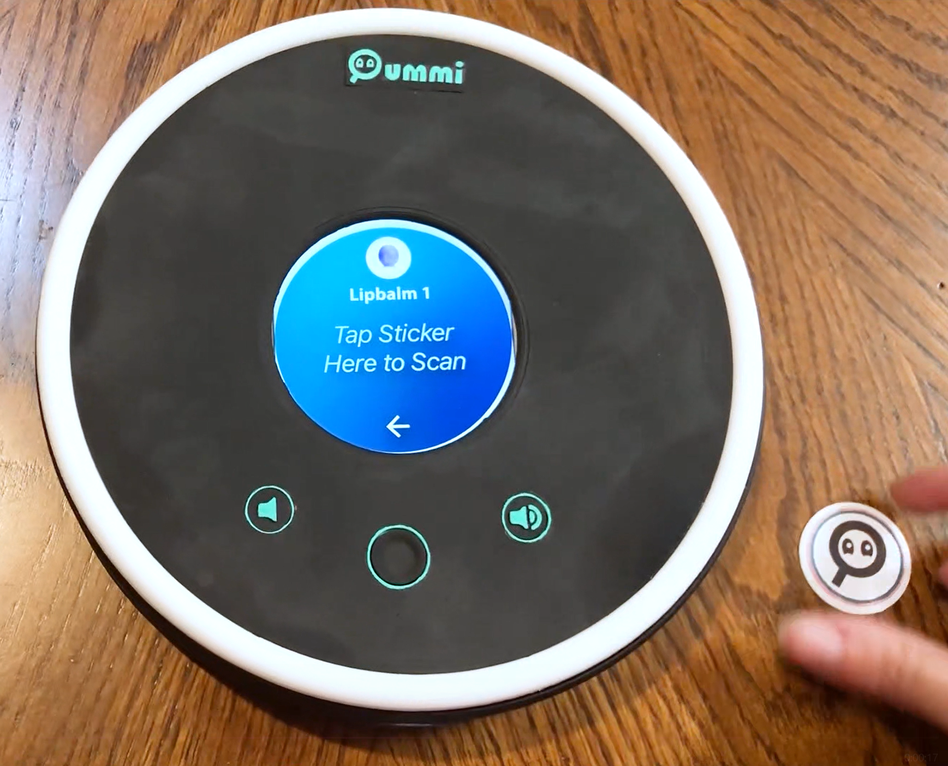
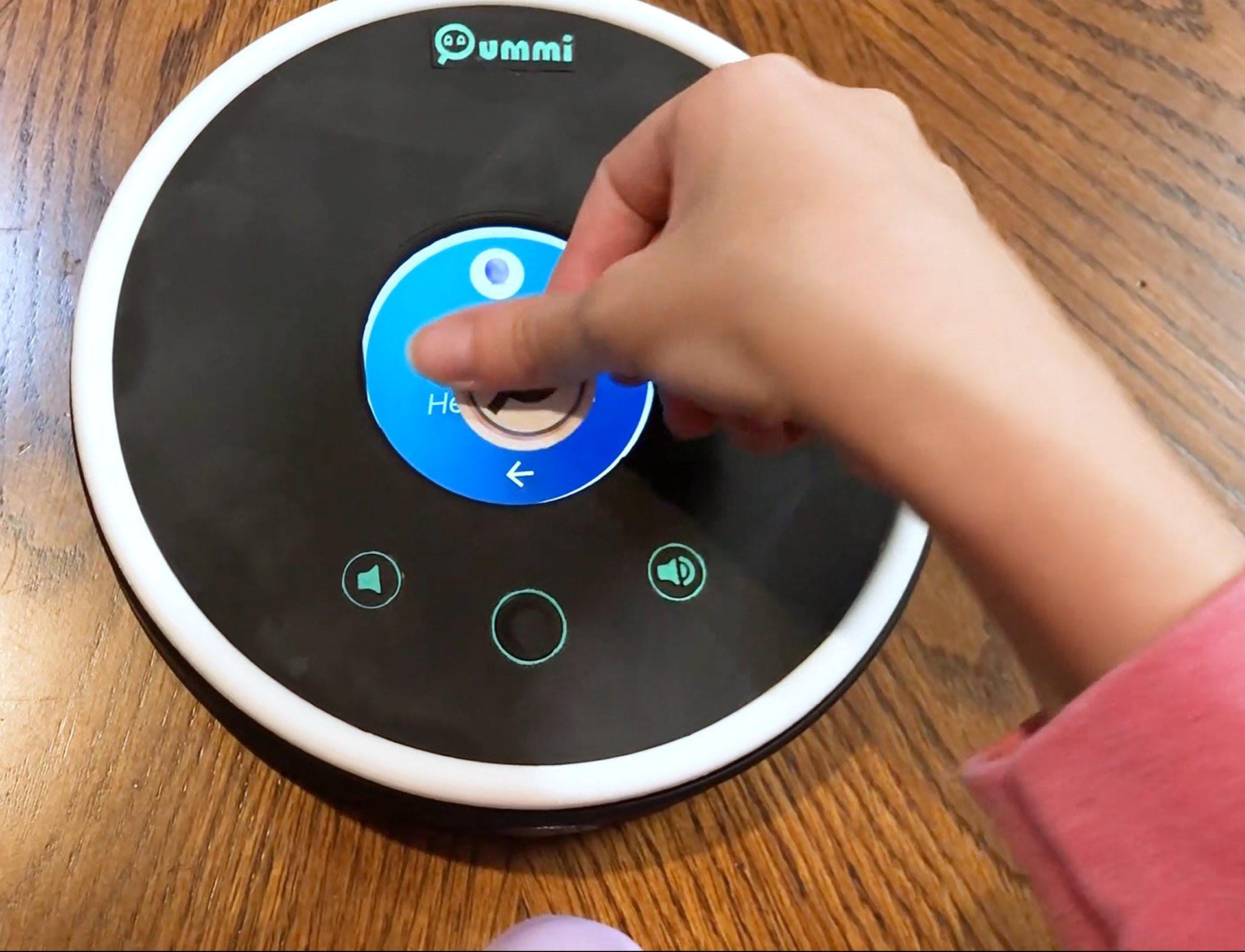
1. Add an item to the device by registering the device name and scanning the sticker, then attaching sticker to item.
2. When item is lost, say "Hey Oummi, find my X"
3. Hold the Oummi device and follow the navigation cues that will lead you to your item.
4. When item is found, put device back in it's place on its charging plate (the device will remind you to do so).
The 3 Components
The User Interface
The User Interface of the device was created with Adobe XD, with some components designed in Illustrator. The interface is where the users would spend most of their time, and it is the component users will interact with the most since it is the primary part of the device. In the interface, the users get to add items and search for their lost items, and it's the mediator between the other two components.
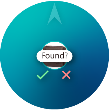
The primary change between the final UI iteration and the one before it is the navigation screen. The very first navigation screen was very confusing to most users. Then it was redesigned to only include the important information, which were the arrow, item image, and cue for location. However, most of my users found the word "up", which I used to refer that an item was "upstairs", to be very vague and confusing. Therefore, the text cue was replaced with an image cue of a person going upstairs to make that as clear as possible.
The secondary changes focused on eliminating unnecessary double-clicking steps, and replacing them with automatic transitions to make it flow better and make the interaction more intuitive and less confusing.

Want to give the UI a try?
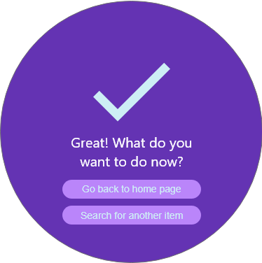
Go to https://xd.adobe.com/view/d0c0d6ea-4207-4188-a692-7fa3a2c88260-8593/?fullscreen&hints=off and try to add an search for an item and add an item.
Search for item:
- Click the Search button from the Home screen
- Type "wallet"
- Select "Mary's Wallet"
- You will be redirected to the Navigation screen.
Add an item:
- Click the + button on the Home Screen
- Type "Lip balm 1" in the text bar then click go
- Take a picture of the lip balm
- Select "Mary" as the user
- Tap to scan the sticker
- Now your item is paired to the device!
The Physical Device
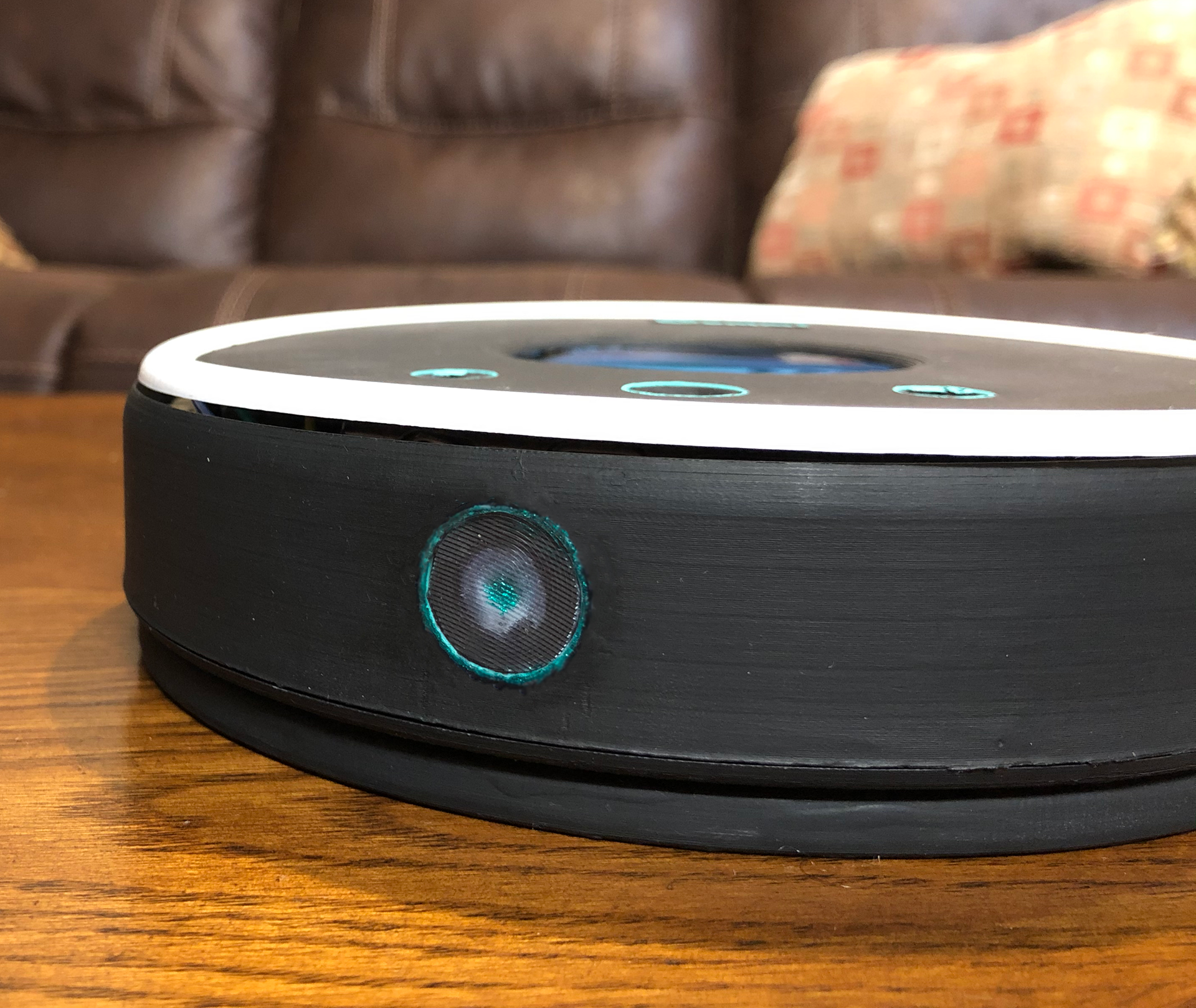
The physical device has four main parts: the base piece, the camera, the buttons, and the light ring.
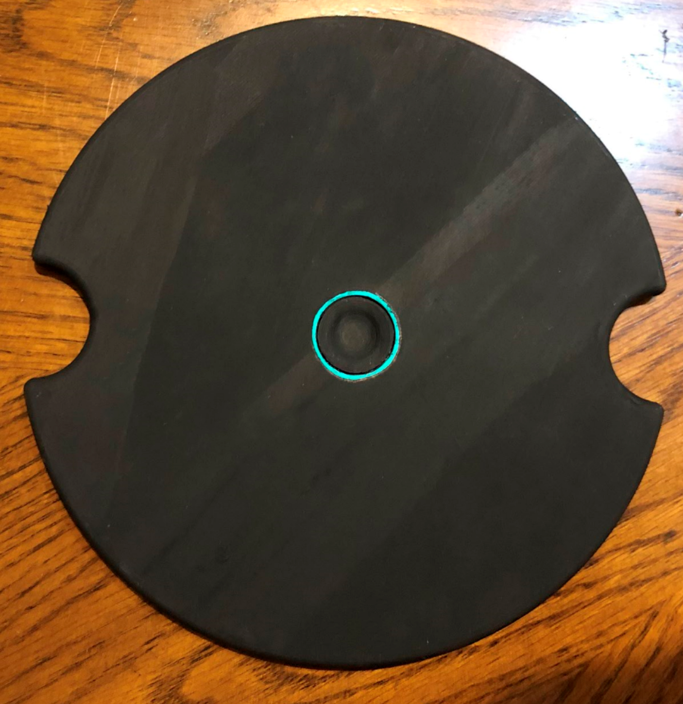
The Base Piece
A question I got a lot during my user testing was, "What happens if you lose the device itself?!"
This is where the base piece comes in. This piece has two functions. The first is a wireless charger to charge the device while it's placed on it, and ideally the device would always be placed on it in a set location when it's not being used. The second function is to find Oummi if it ever gets lost around the house. The Oummi interface does give the user a reminder message to place Oummi back in its, but people could still forget to do that, which might make them lose the device. Therefore, there is a button at the center of the base piece that when pressed, would make Oummi beep to help the user find it.
The Camera
The camera is found on the side of the device, and allows the user to take a picture of their item when adding it to the system. My original CAD design had the camera at the top/back of the device, but when trying to test the mock up, users felt like it would be easier to use the camera if it was at the bottom/front of the device.
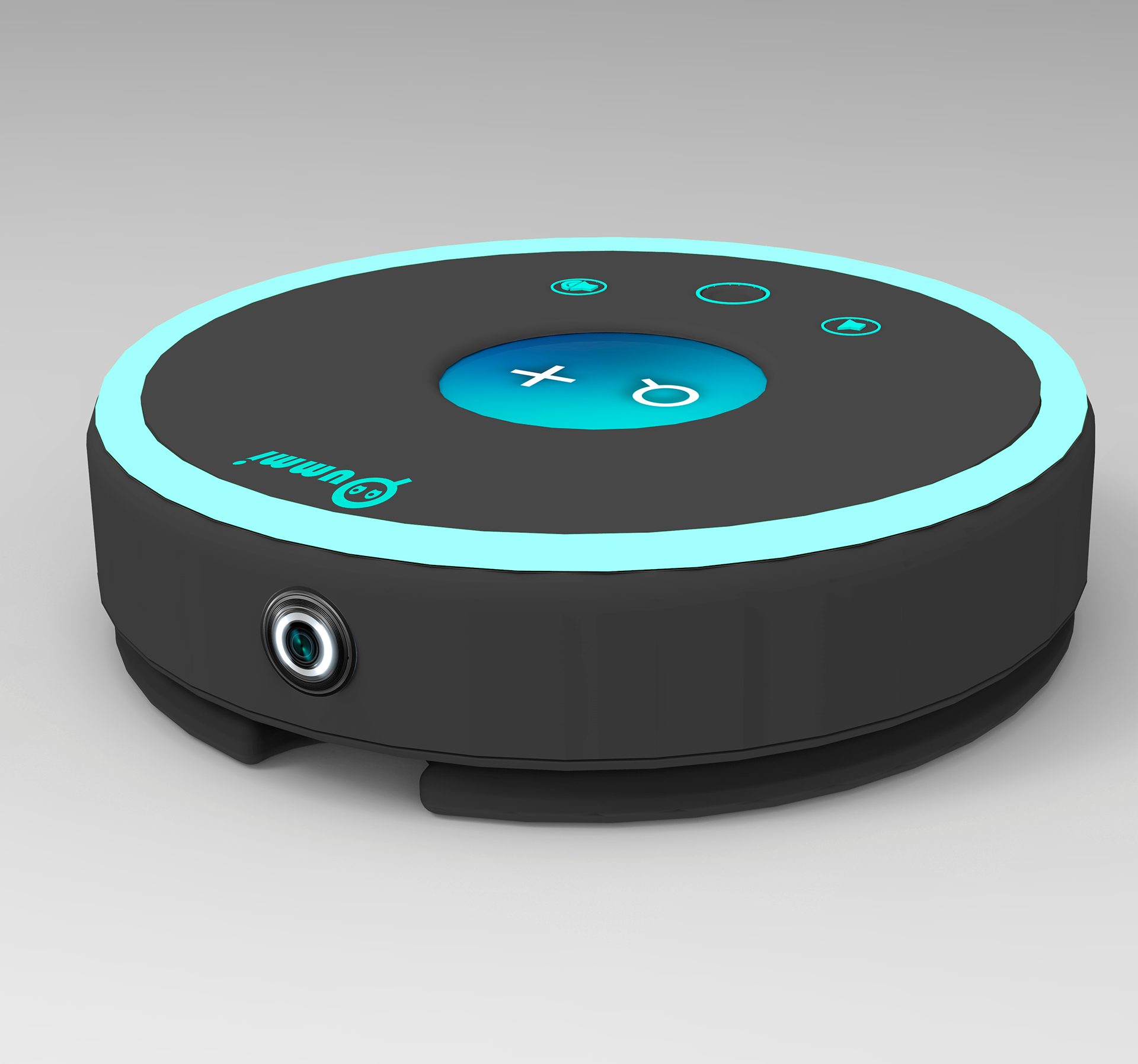
The Buttons
There are only three buttons on this device. The middle button is a Home button that takes the user to the home screen when pressed. The other two buttons are Volume Control buttons for the sticker audio. If the sticker beeping cannot be heard, the user could try turning up the volume to hear it better. And if for any reason the user does not want to hear the beeping, they can lower the volume and rely on the arrow navigation instead.
The Light Ring
Originally, the light ring around the device was going to only be there for aesthetics. However, it had potential to be used as a form of feedback for the user.
Therefore, I conducted more research through user interviews and online search to understand human centered design methods in regards to the use of lights, and finalize the function of the light ring.
Here are the final light animations:
● Light off: device is off
● Light on: device is on
● Light fading in/out: device is listening
● Light is rotating with the navigation arrow: device is searching for item
● Light flickering rapidly: item found
The Light Ring animation was coded with Arduino, and uses a mini circuit board and memory chip, and it's attached to a portable charger to power it, all of which fit inside the mockup.

The 3 Components Combined
Demo Video